Back
Deliverables
Website, Web app
Role
UX Researcher, Product Designer
Industries
EdTech
Date
2025
While it's too early to have concrete metrics, success will be measured through:
Customer feedback
Customer feedback mentioning faster & easier application
Fewer office visits Less Stress
Reduced stress from Portals and students
Increased engagement
increased engagement with the system during resumption
Qualitative feedback
Qualitative feedback from users expressing appreciation
Students at Crescent University knew the ritual by heart:
↳ Print the receipt. ↳ Walk to the first office. ↳ Wait in the queue. ↳ Get it stamped. ↳Walk to the next office. ↳ Wait again. All of this, just to secure a hostel bed.
Meanwhile, for hostel portal officers, it was a productivity nightmare. They drowned in paper, verifying stacks of documents by hand and losing hours to administrative grunt work. The entire process was slow, error-prone, and exhausting for everyone involved.
↳One receipt. Five offices. Zero sense.
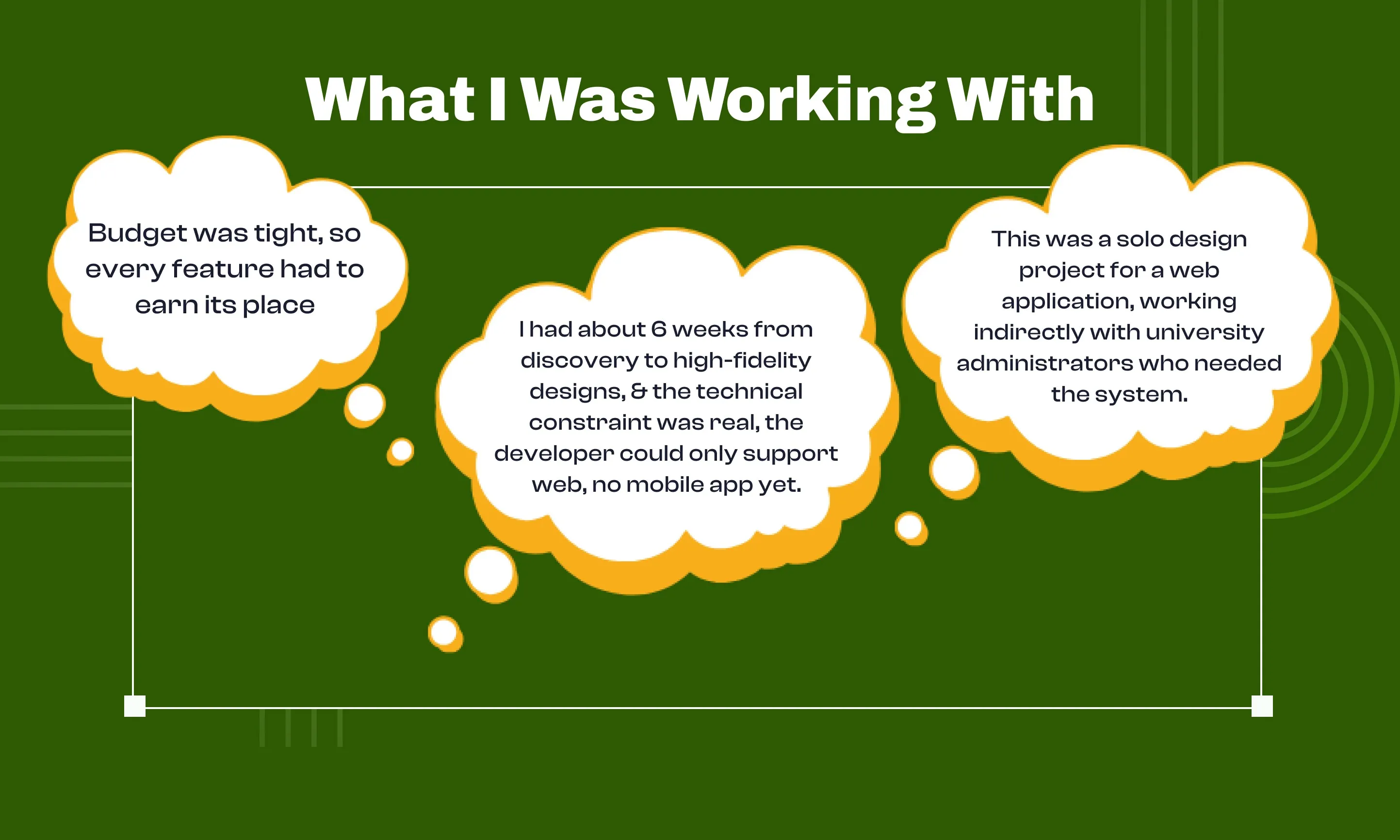
Six weeks, solo, web-only. Every feature had to fight for its life in the design. No budget for experiments. No time for beautiful-but-useless. Just what students and officers actually needed to stop running in circles.
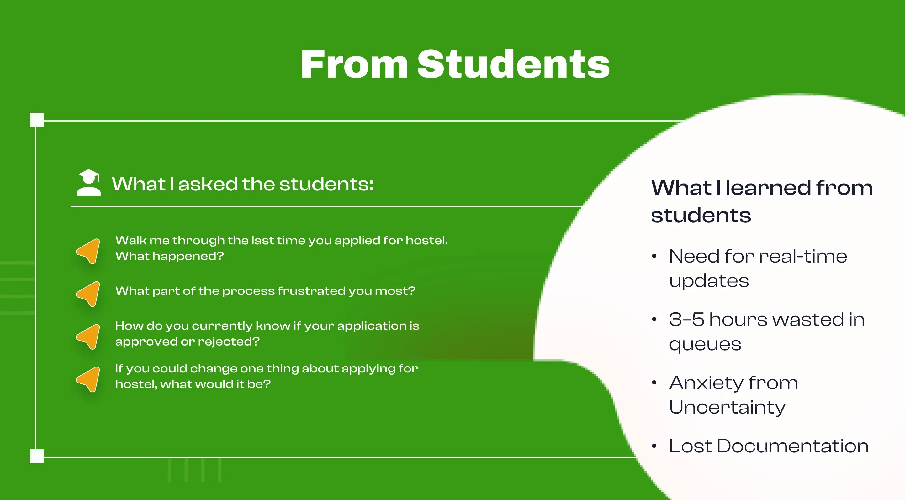
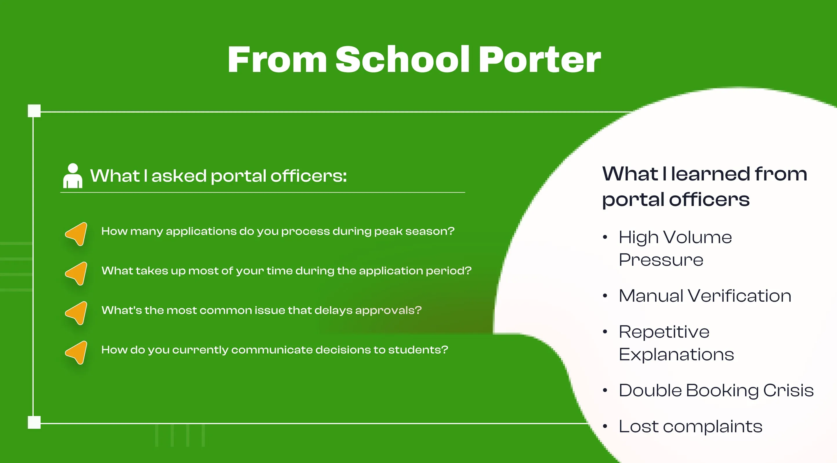
Week one was about getting out of assumptions and into reality. I talked to 12 students across different levels and 4 portal officers who'd spent years managing this chaos. They weren't just users. They were survivors of a broken system.
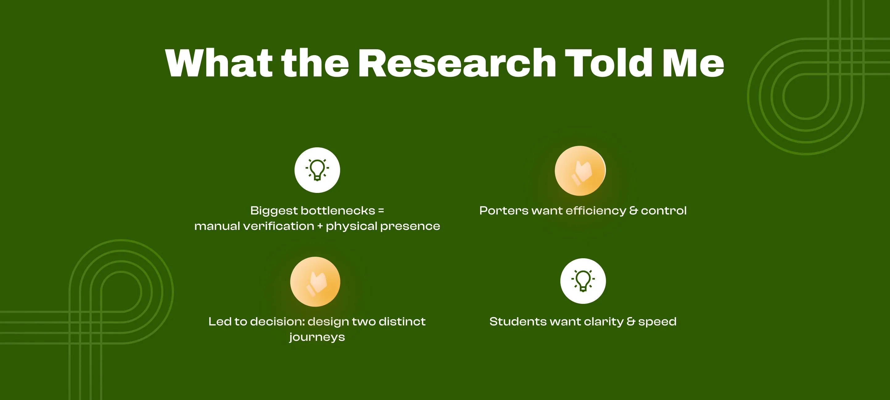
Everyone wanted the same thing from different angles: to know what was happening. Students couldn't track progress. Porters couldn't track workload. The system had zero transparency—turning every question into a trip to another office, every update into another queue.
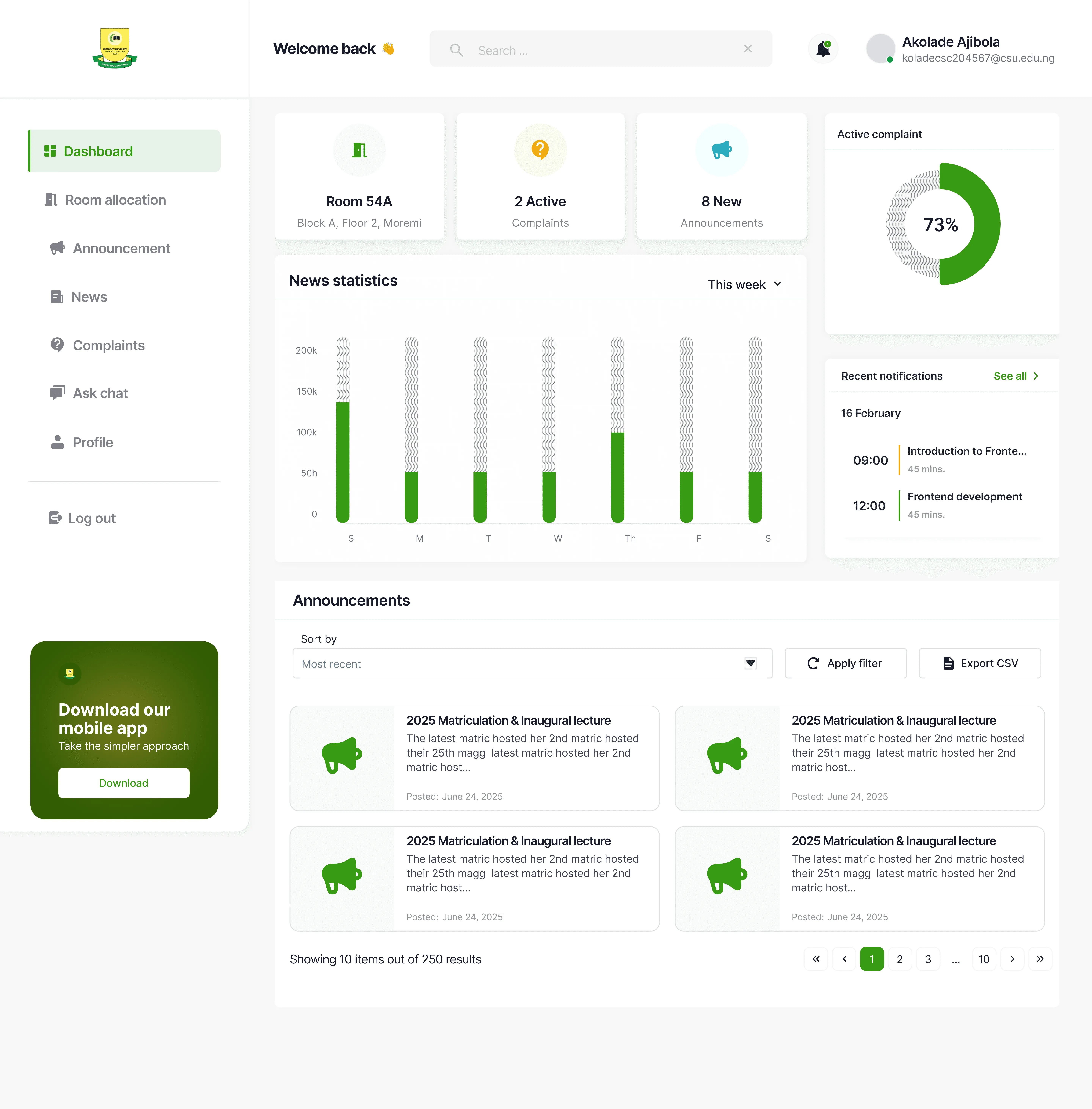
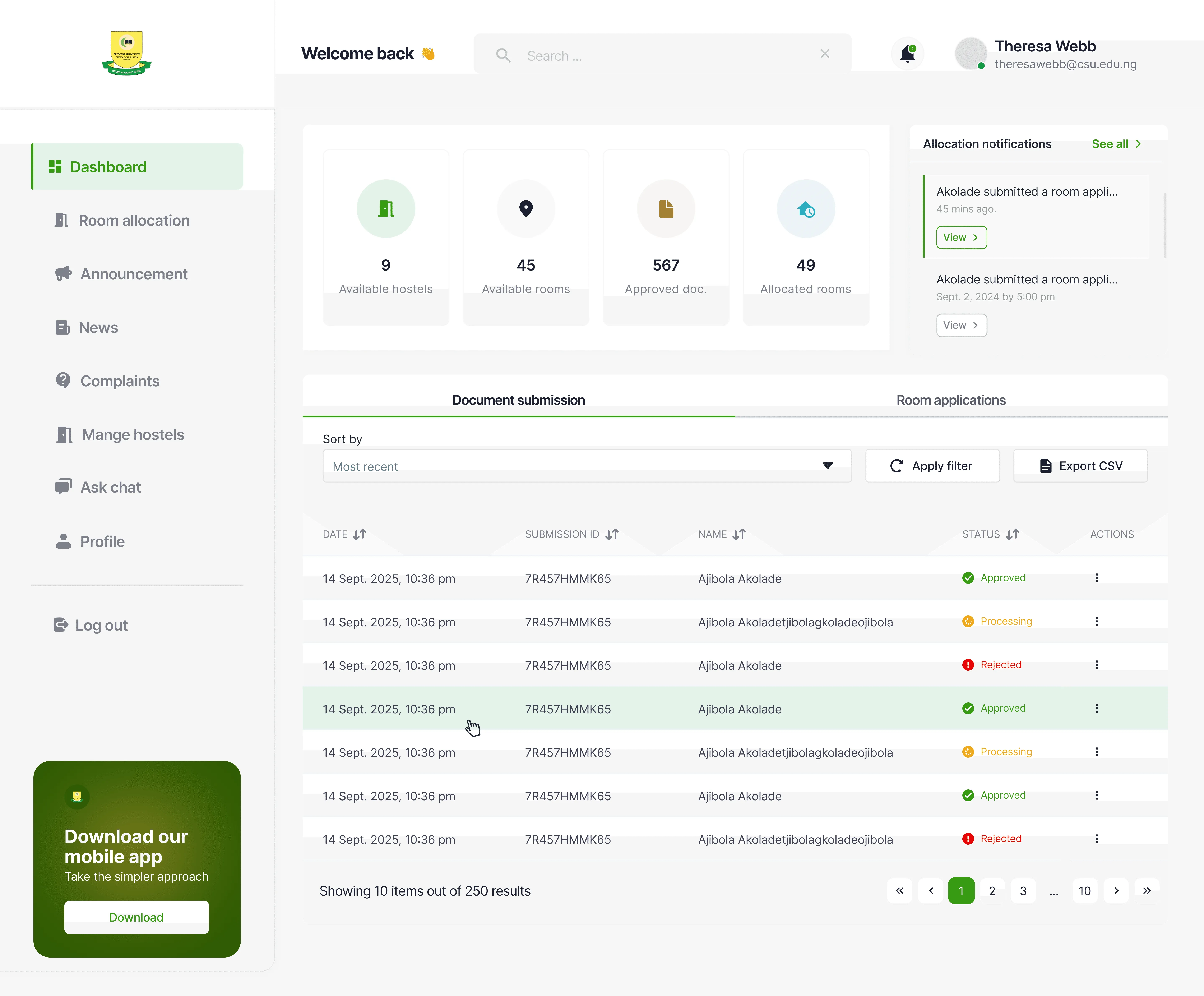
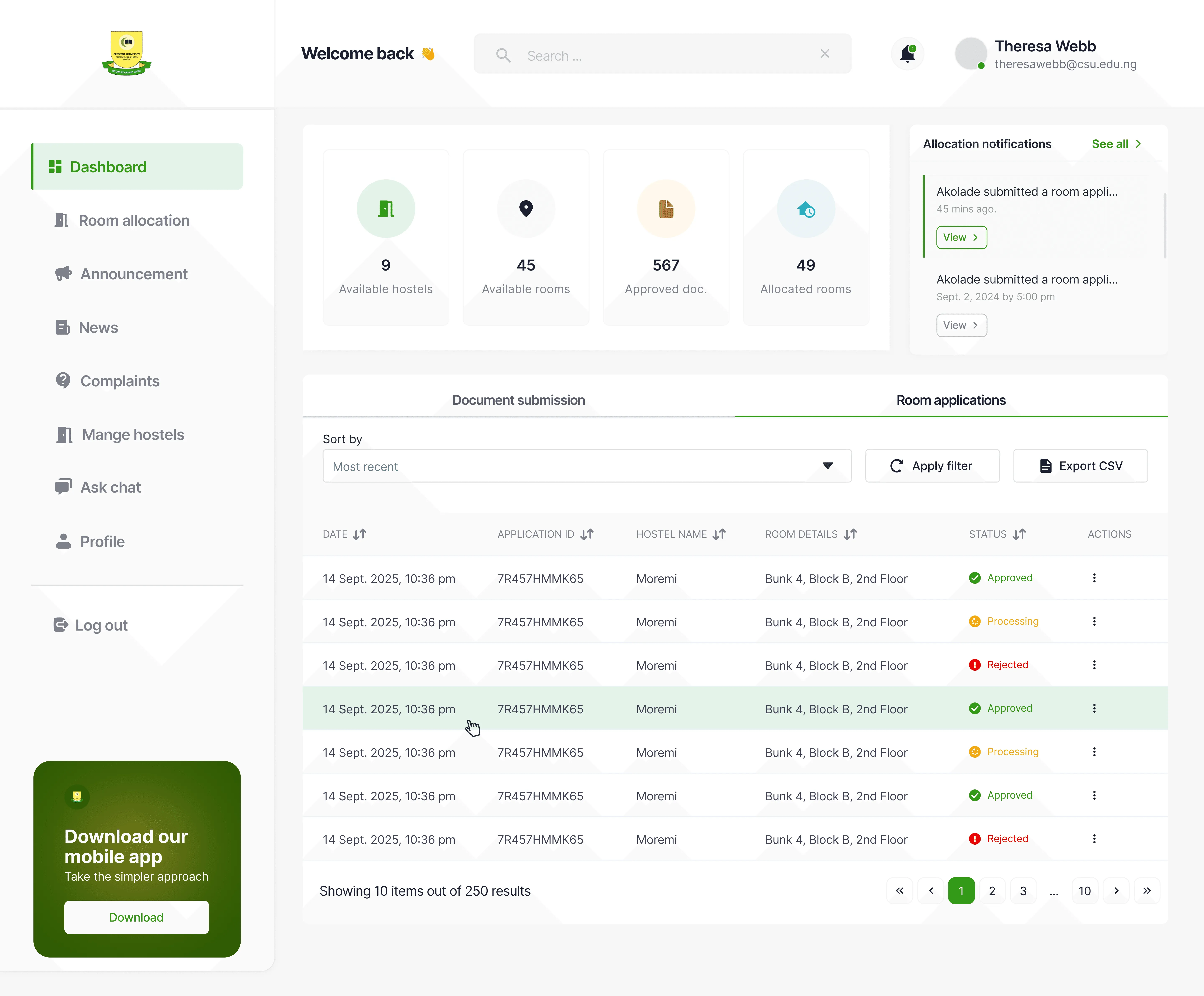
Make the dashboard the single source of truth for both user types. No more office visits to check status. No more manual tracking. Everything you need to know, the moment you need to know it.
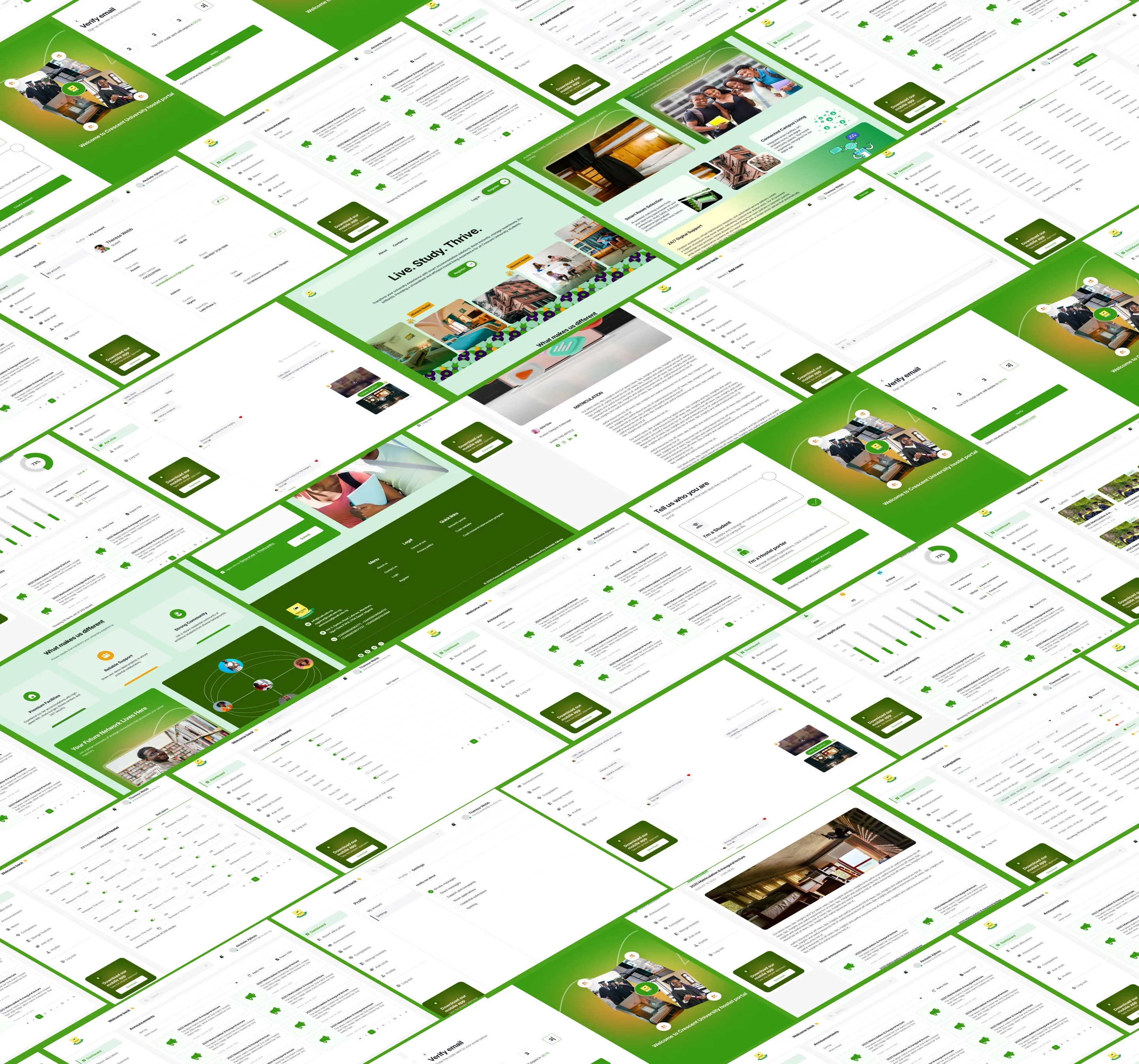
Student dashboard
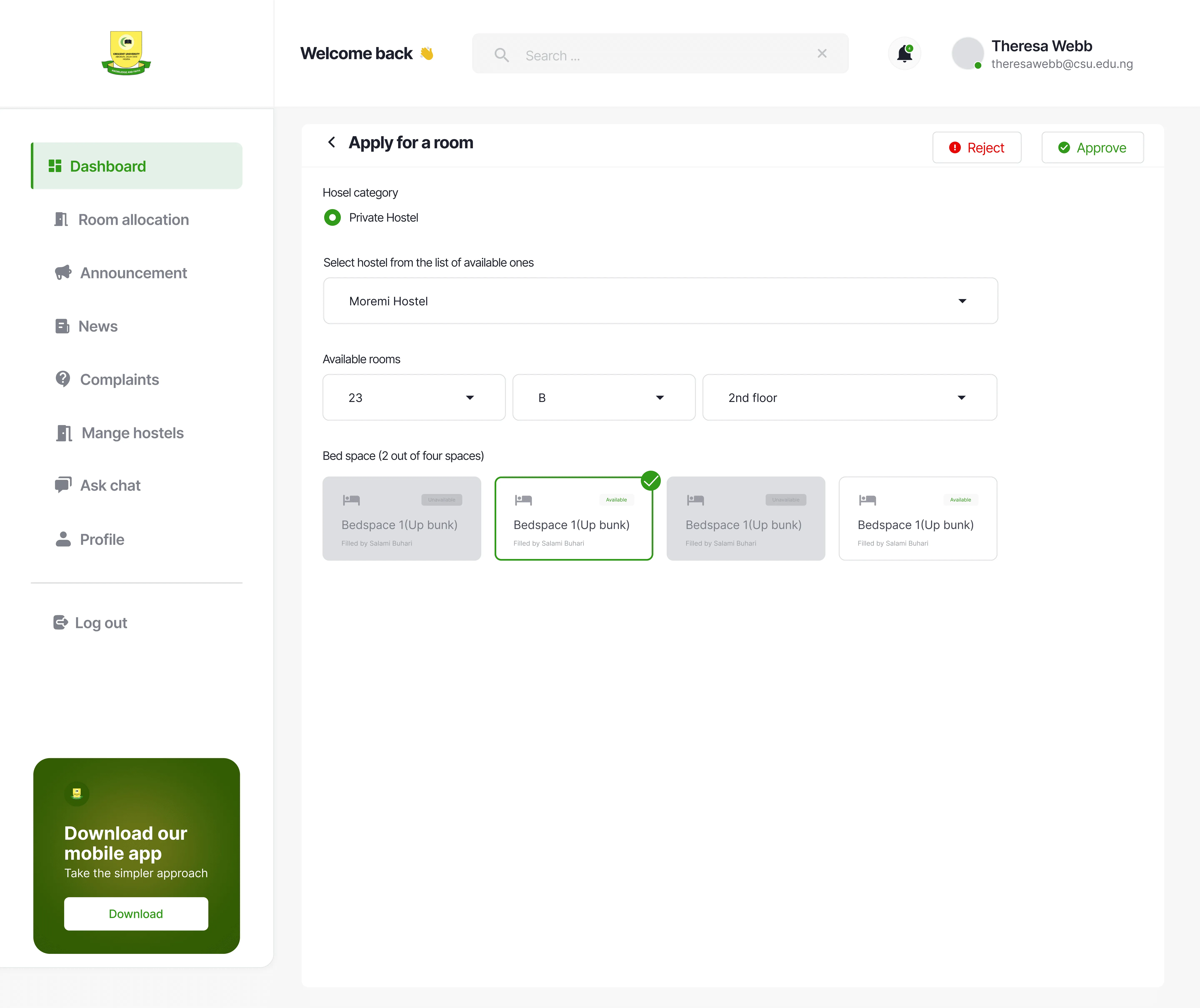
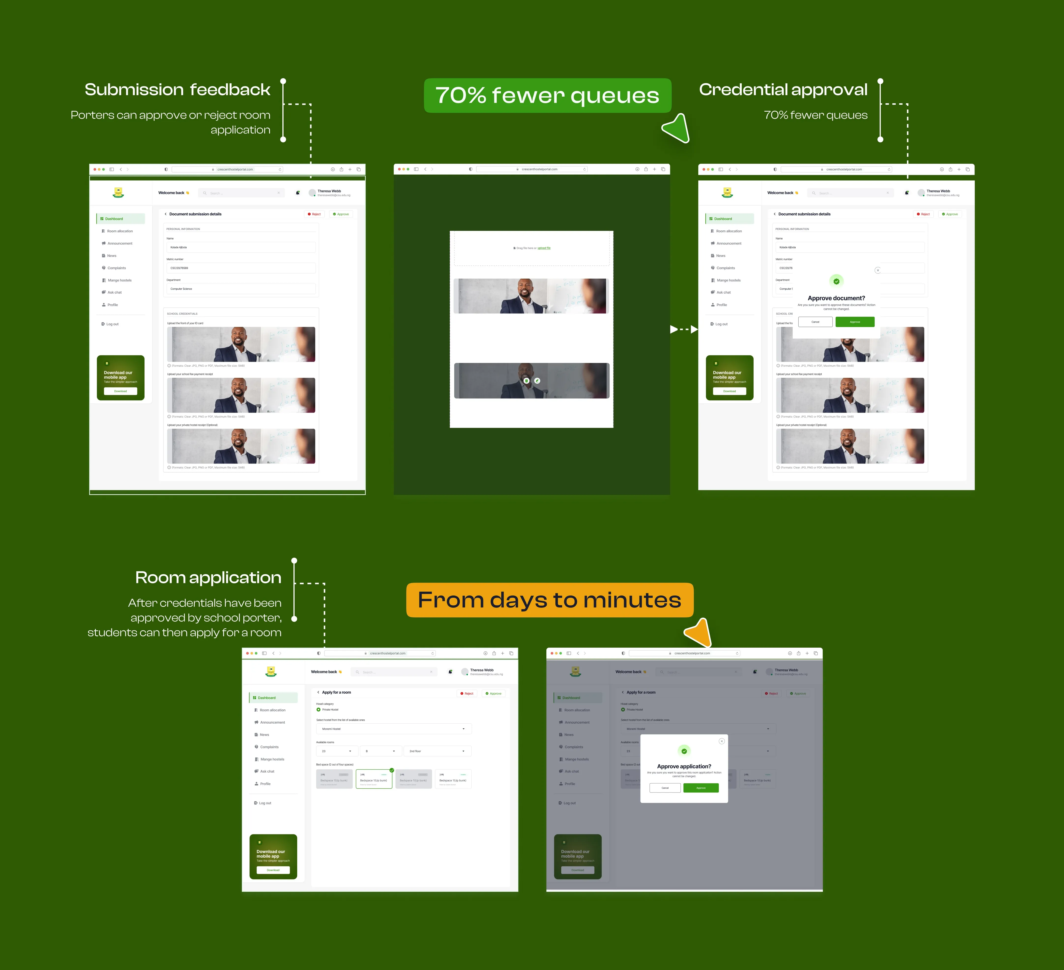
Porter dashboard
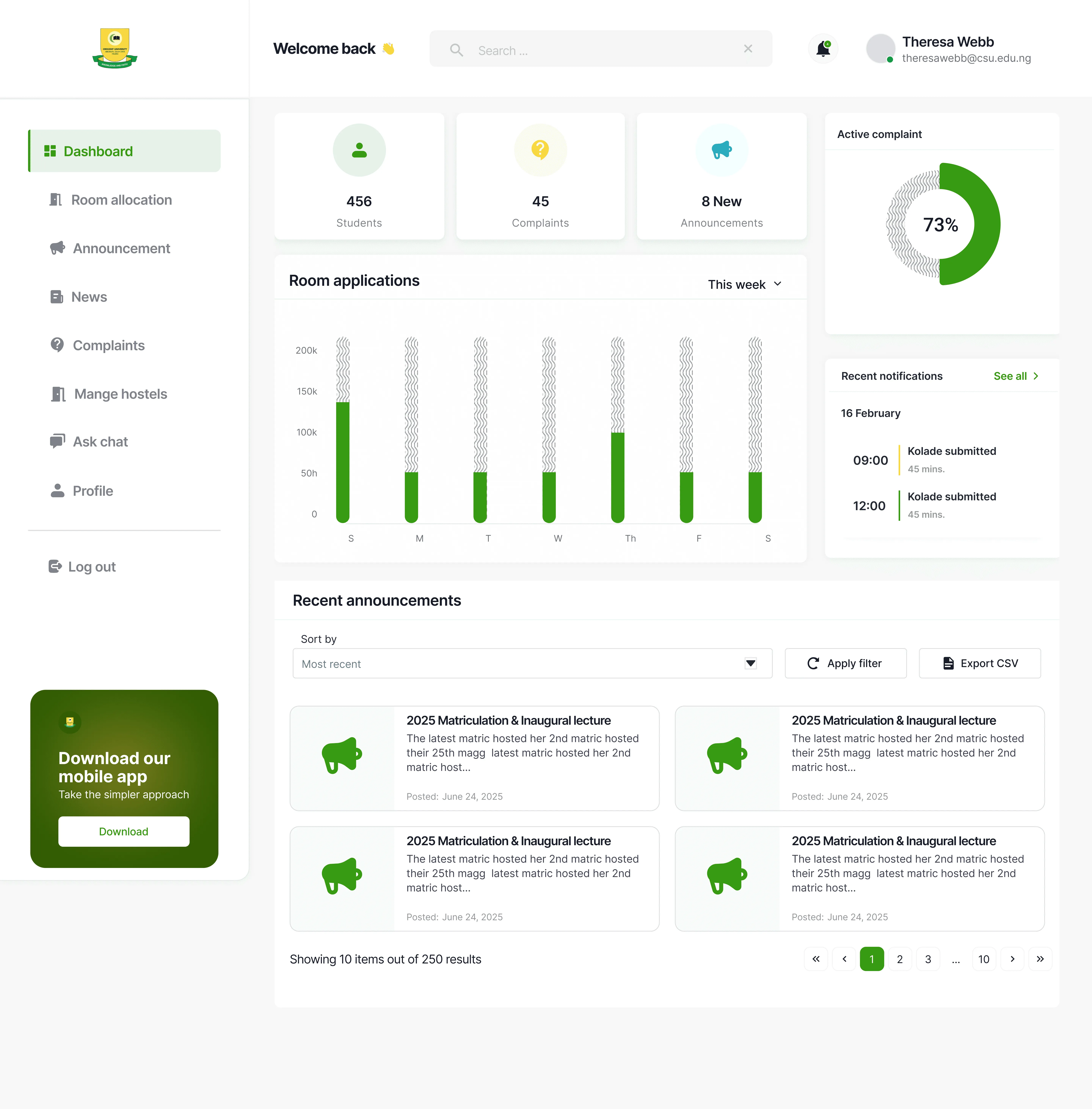
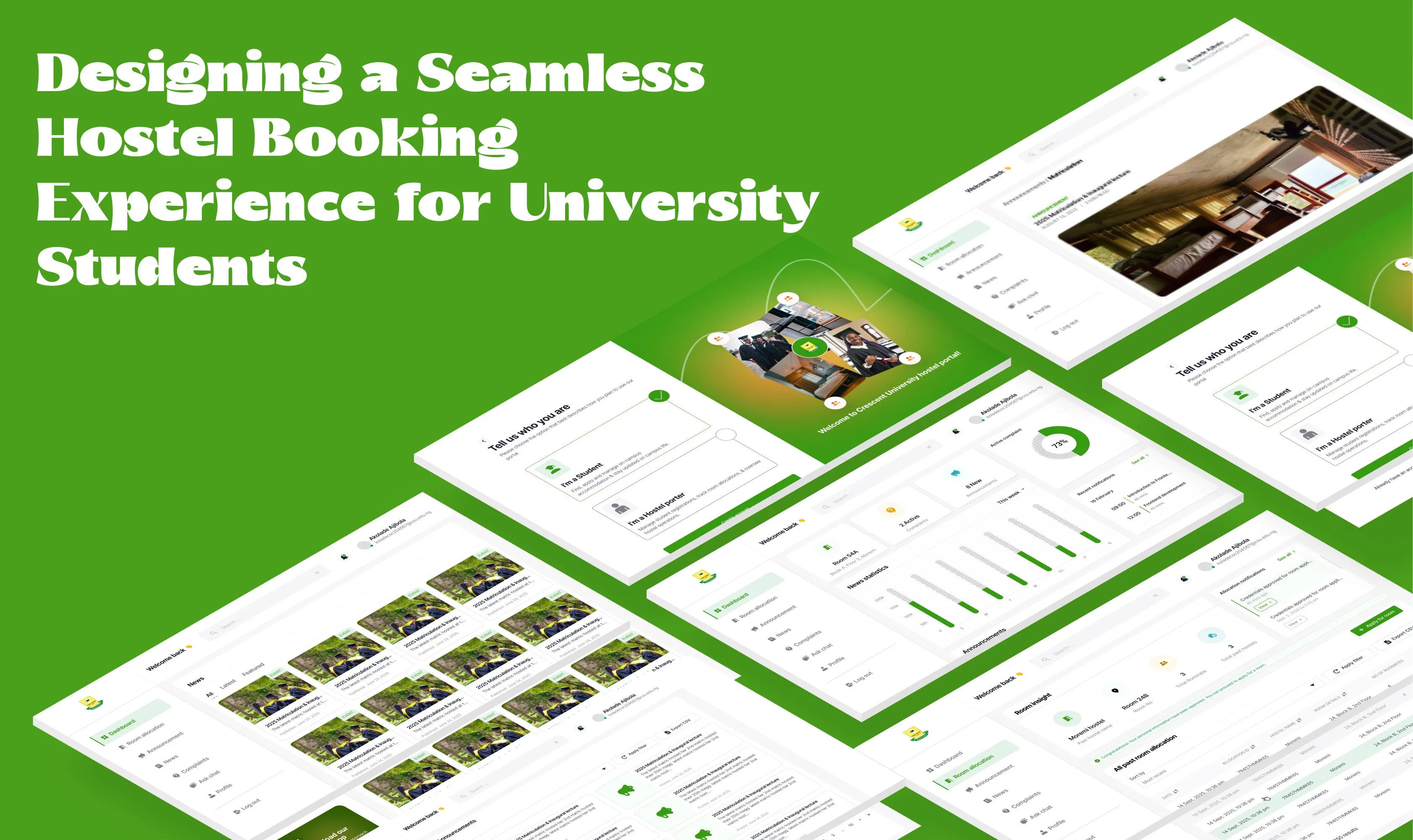
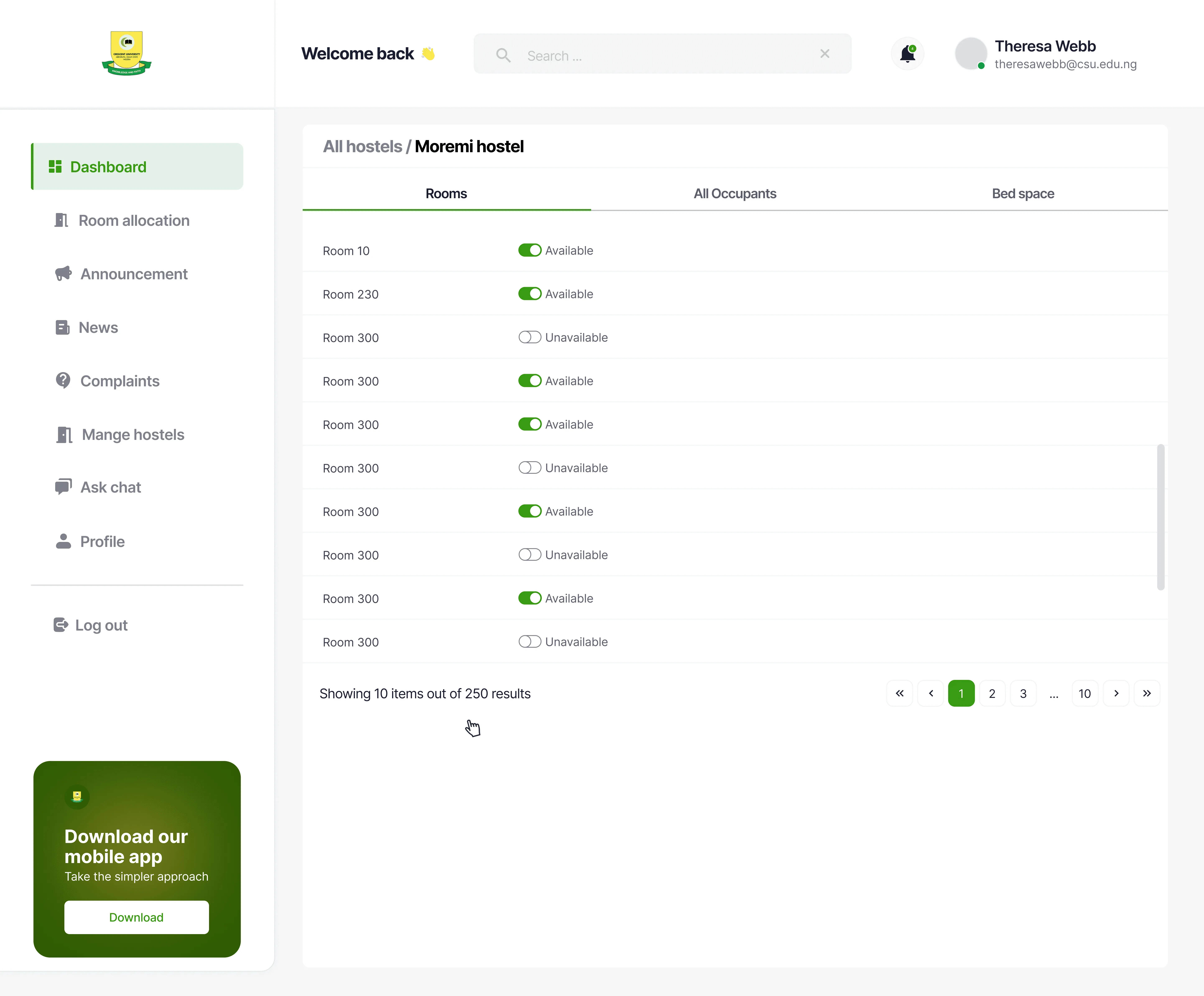
Two parallel experiences designed to mirror real roles while removing friction.
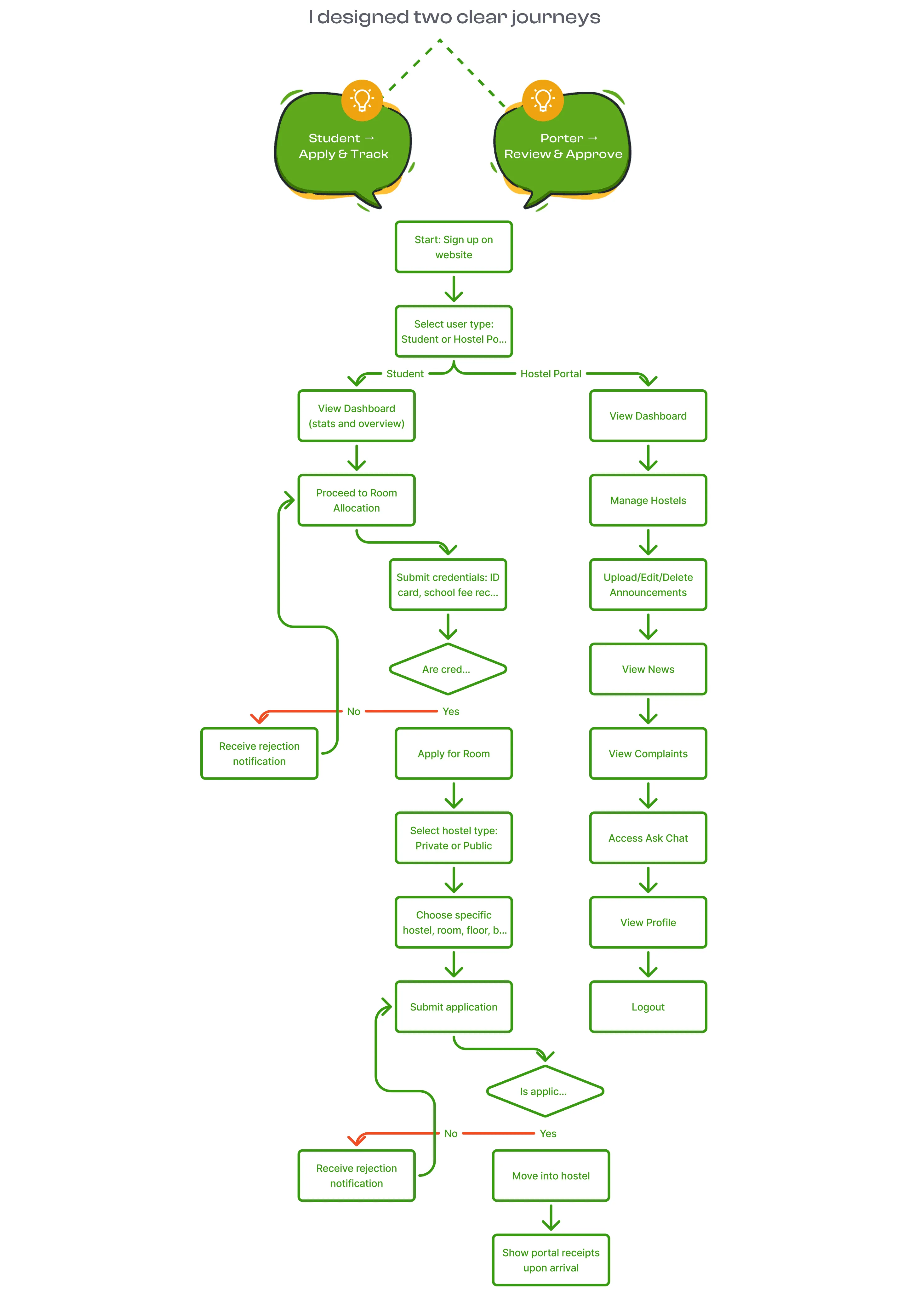
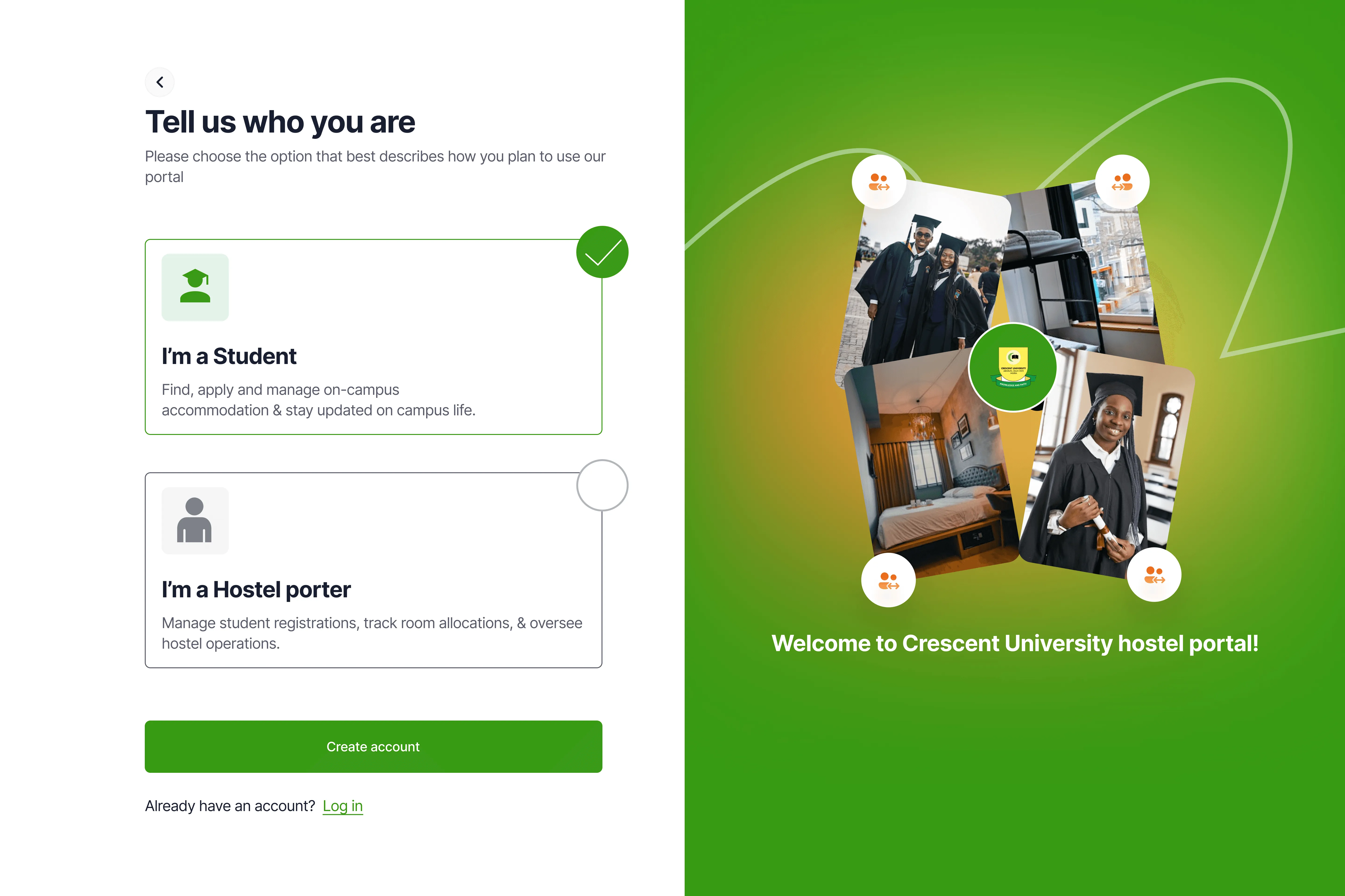
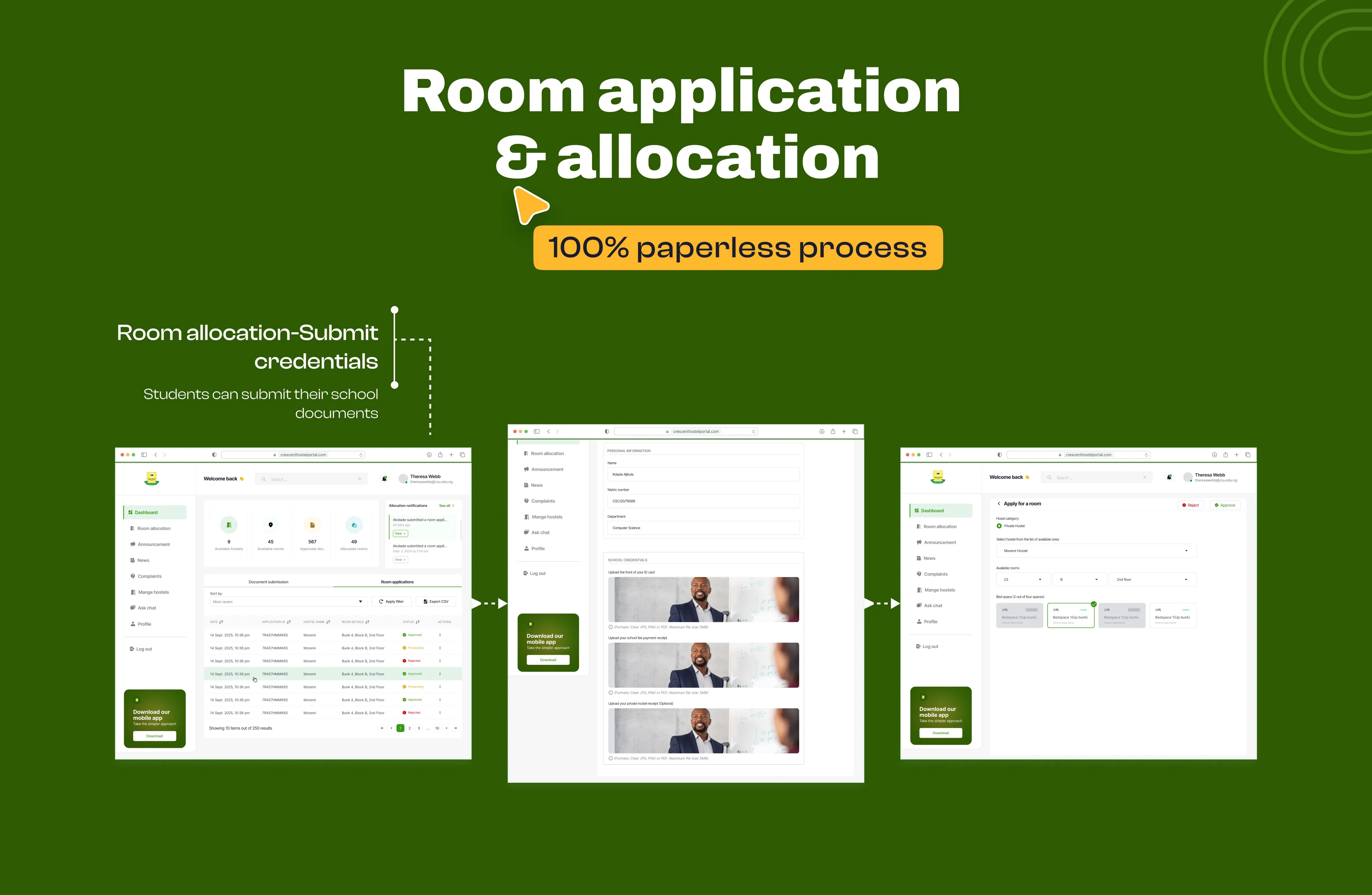
The student flow stripped down to what actually matters: Tell us who you are. Choose your preferences. Get your room. Everything that used to require paper trails and office visits now happens in seamless flow
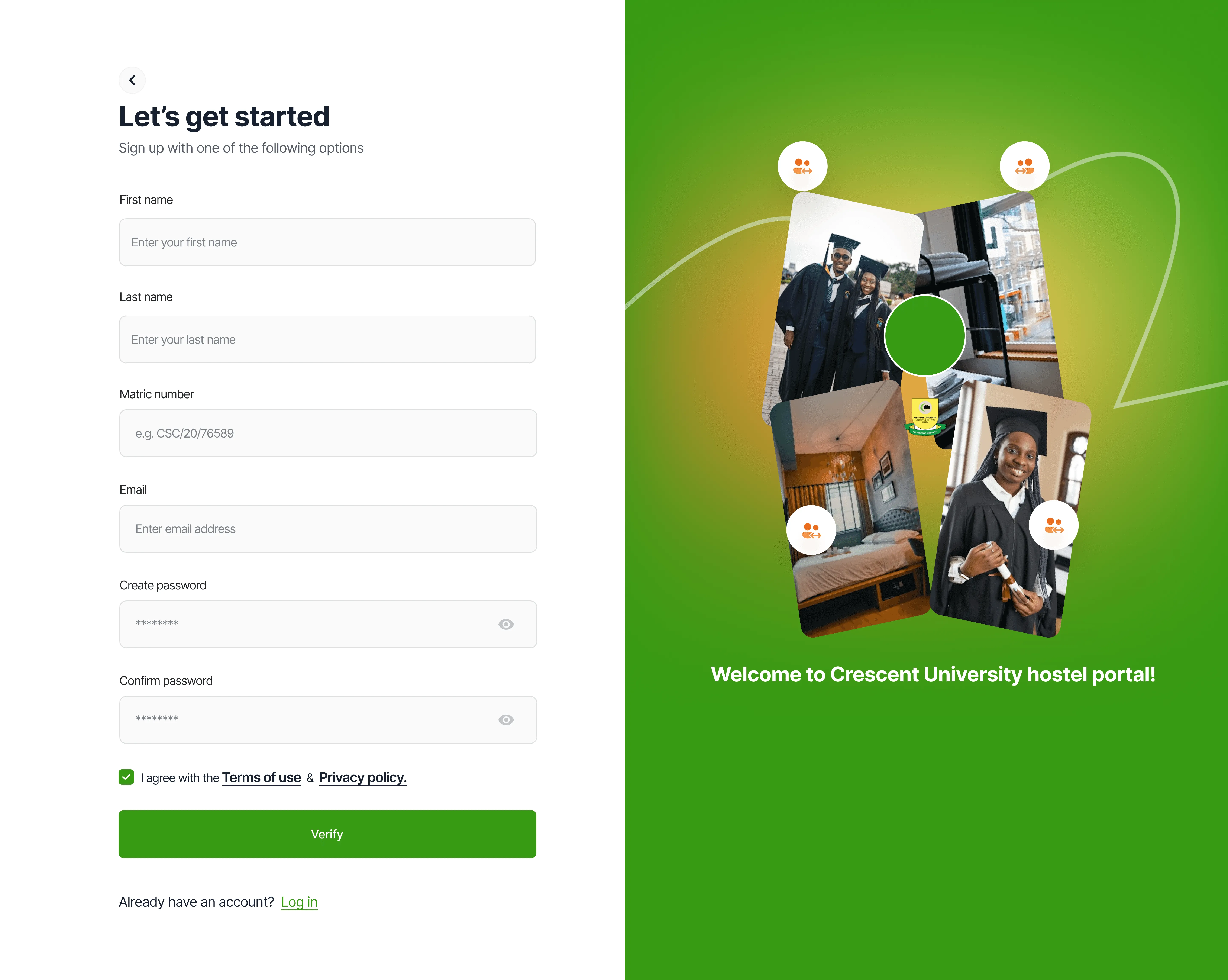
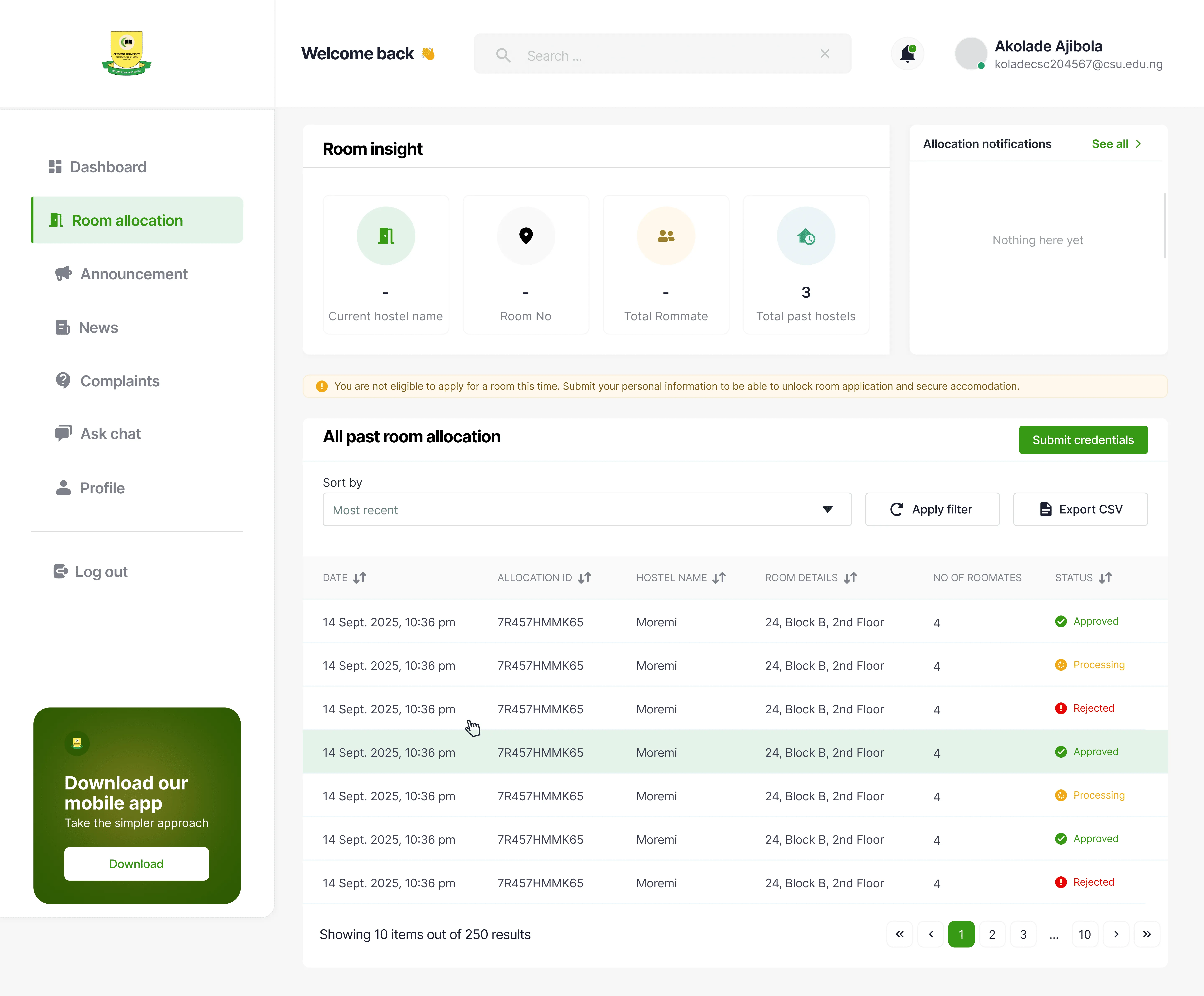
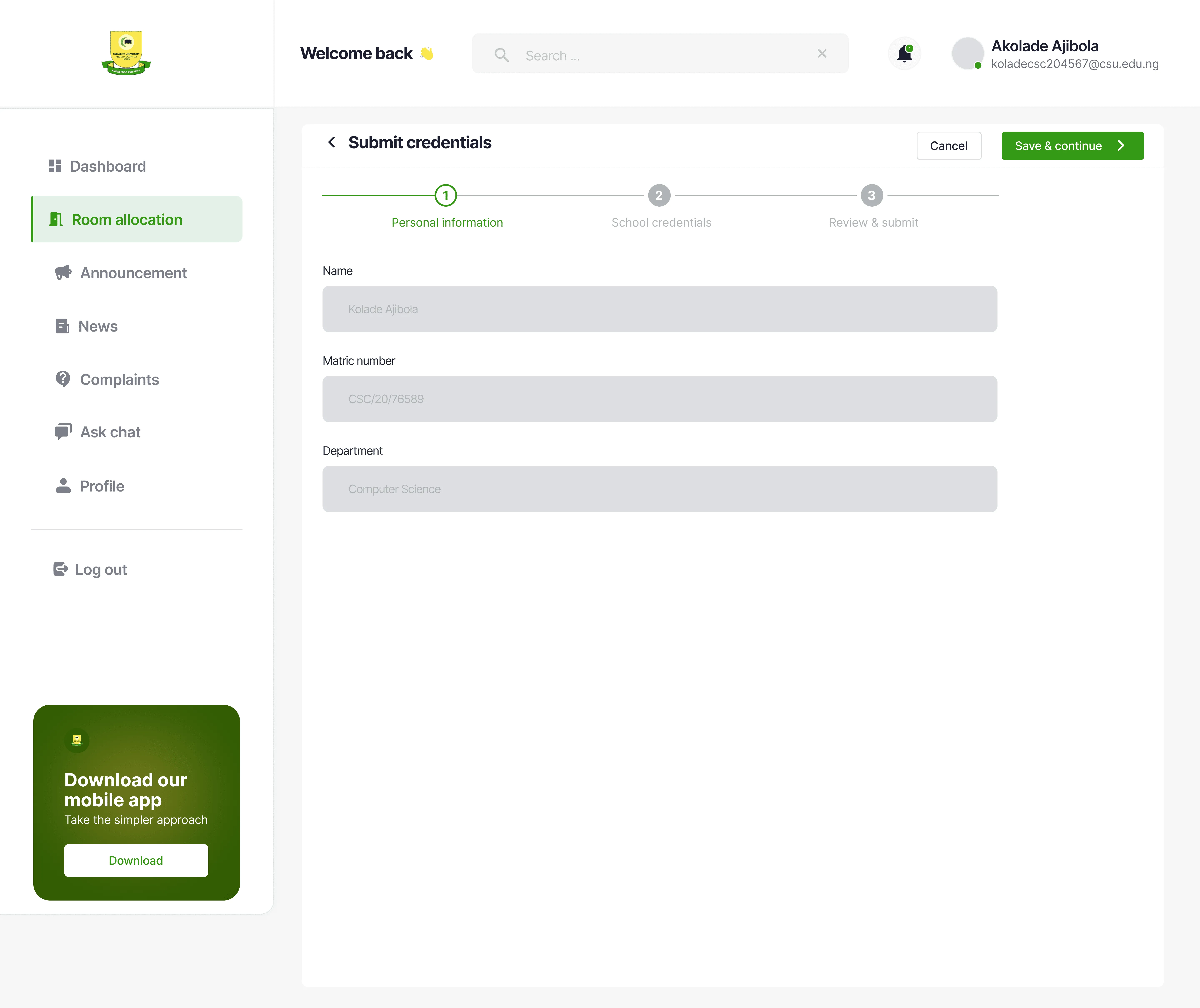
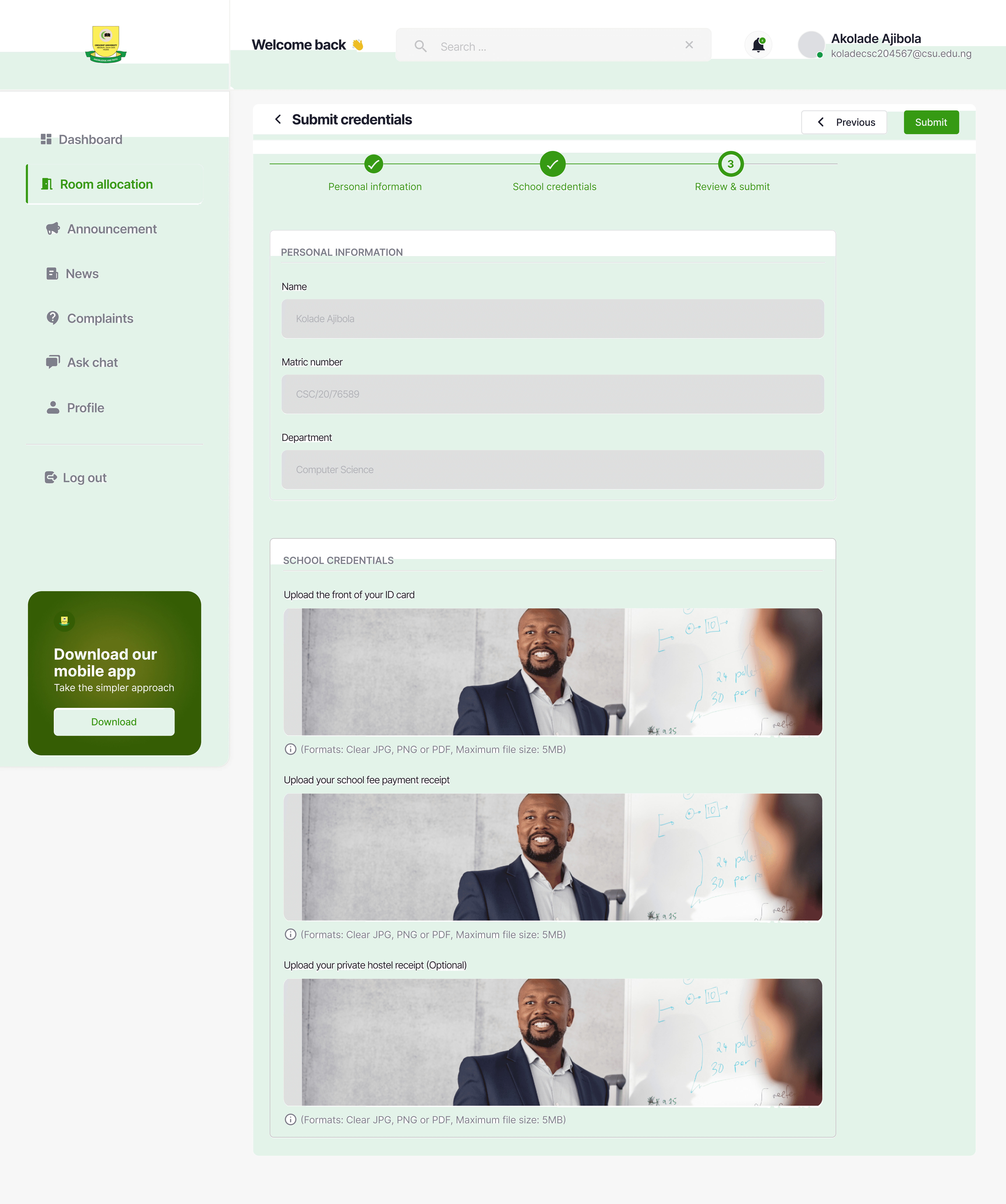
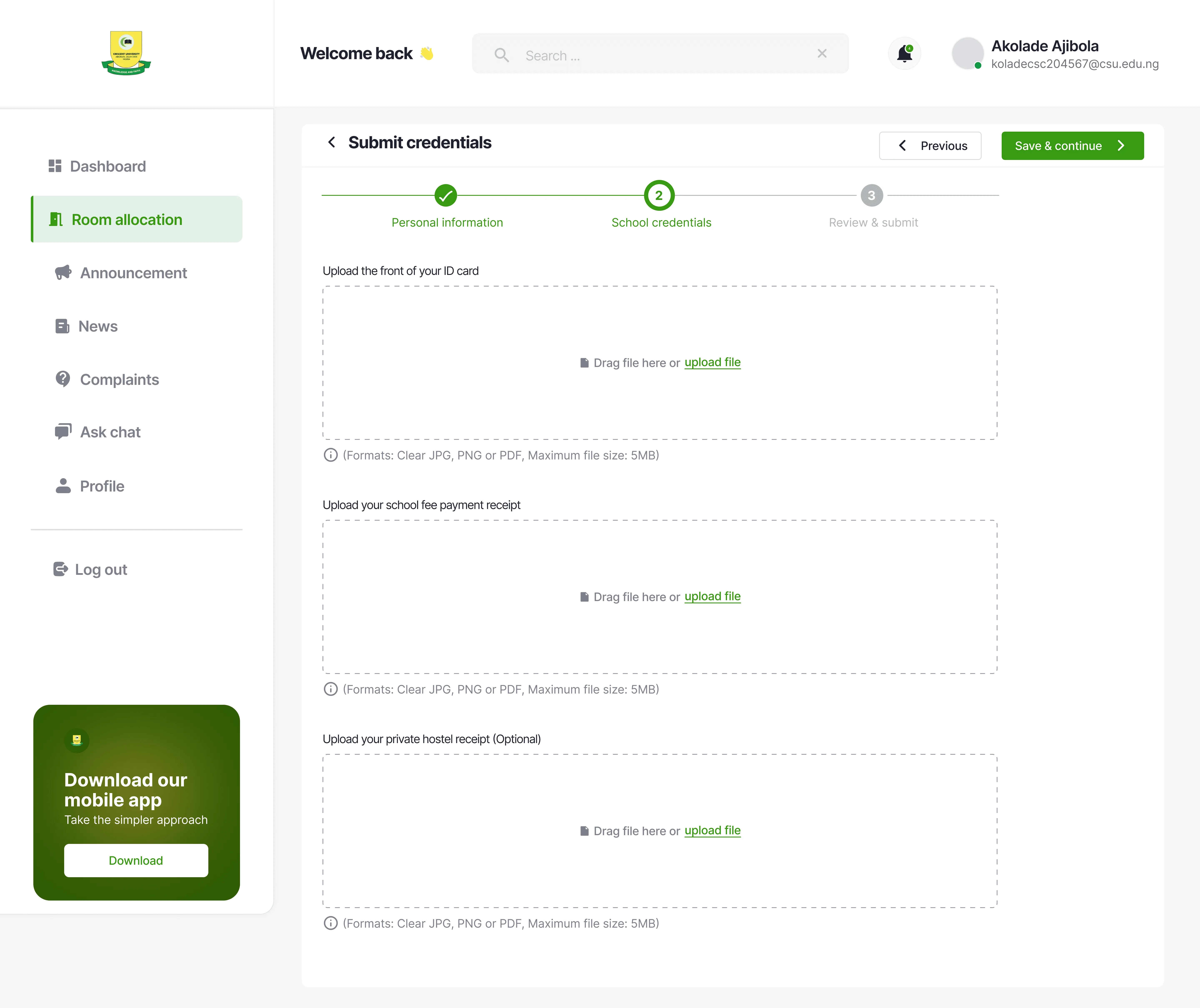
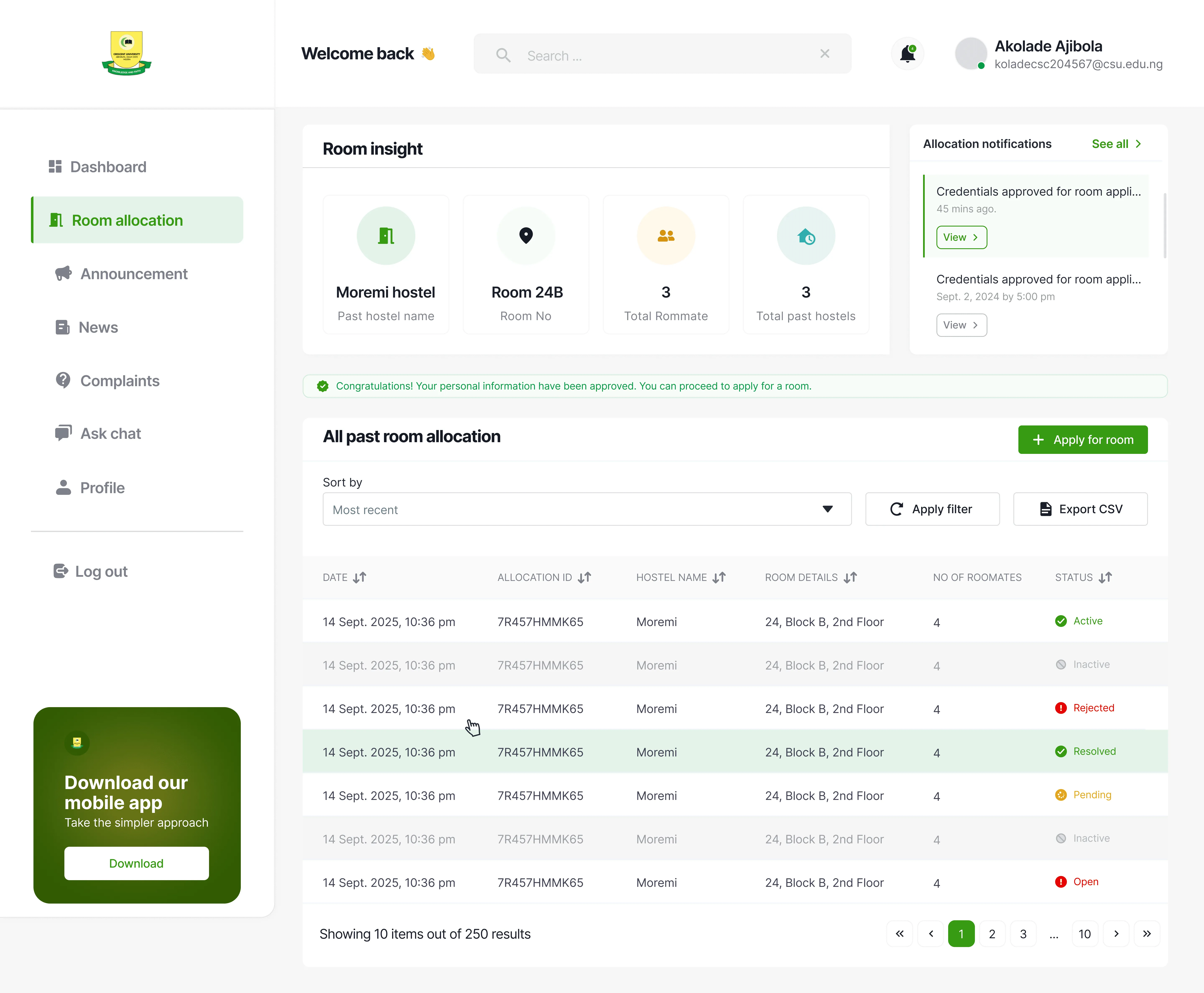
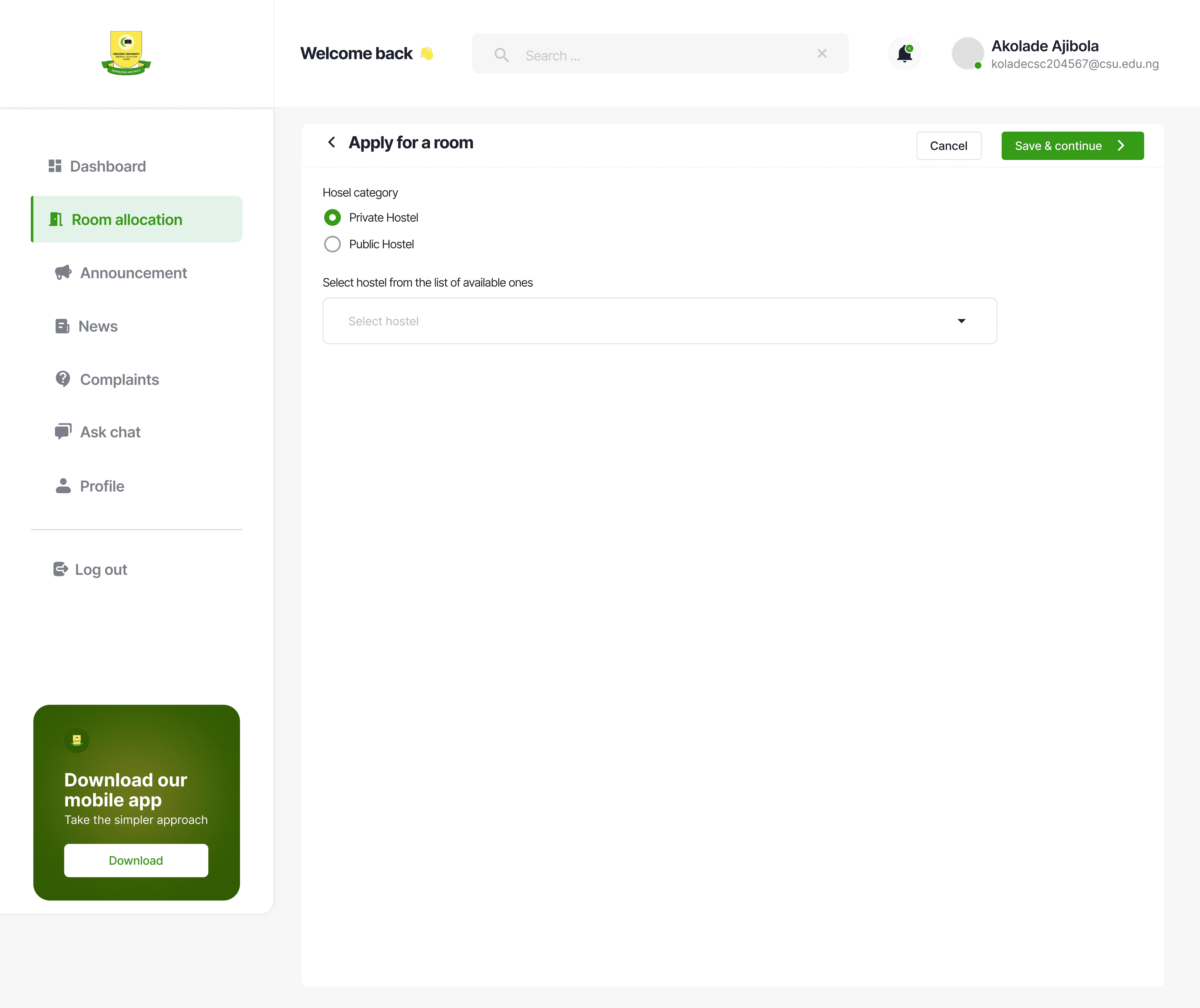
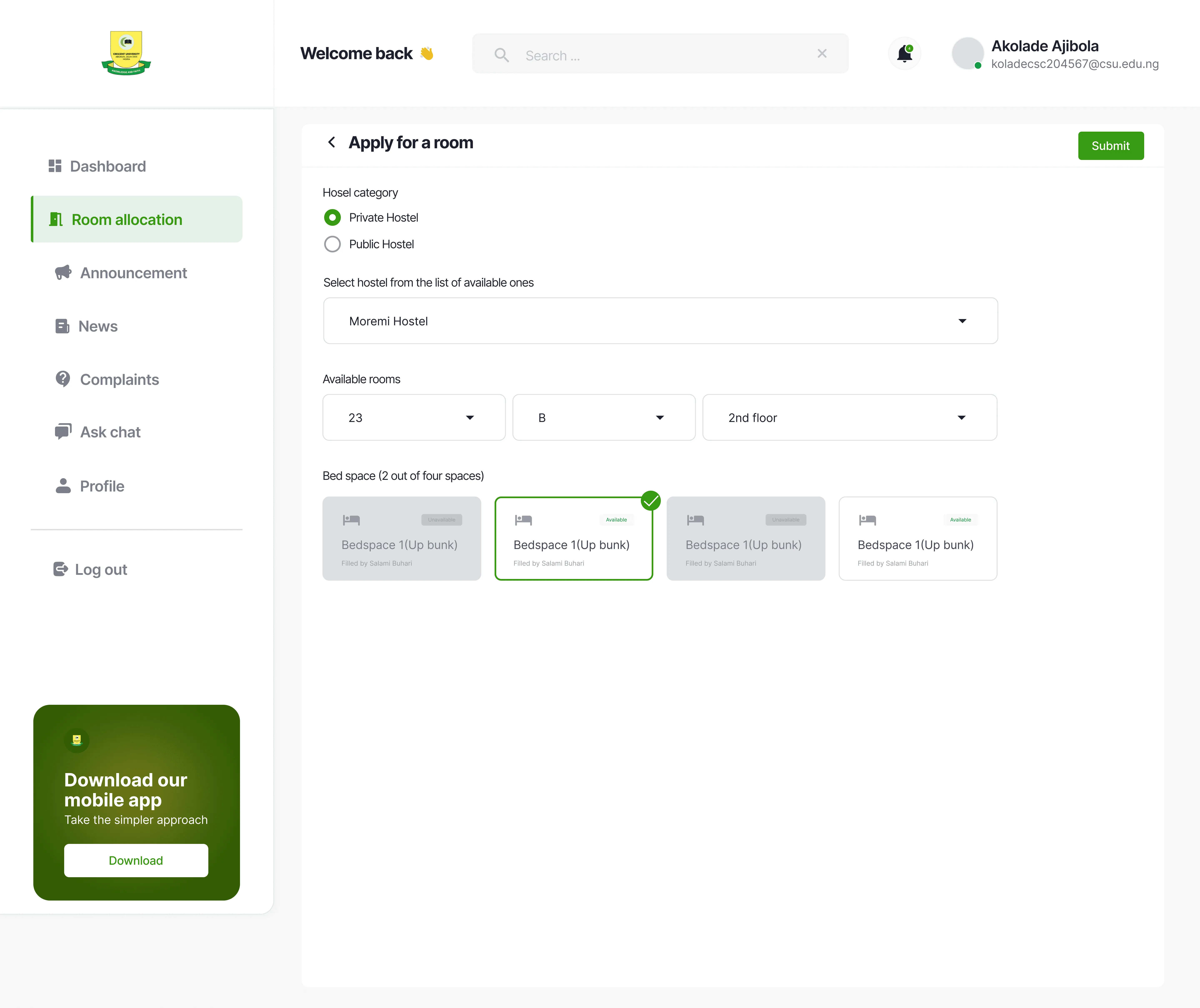
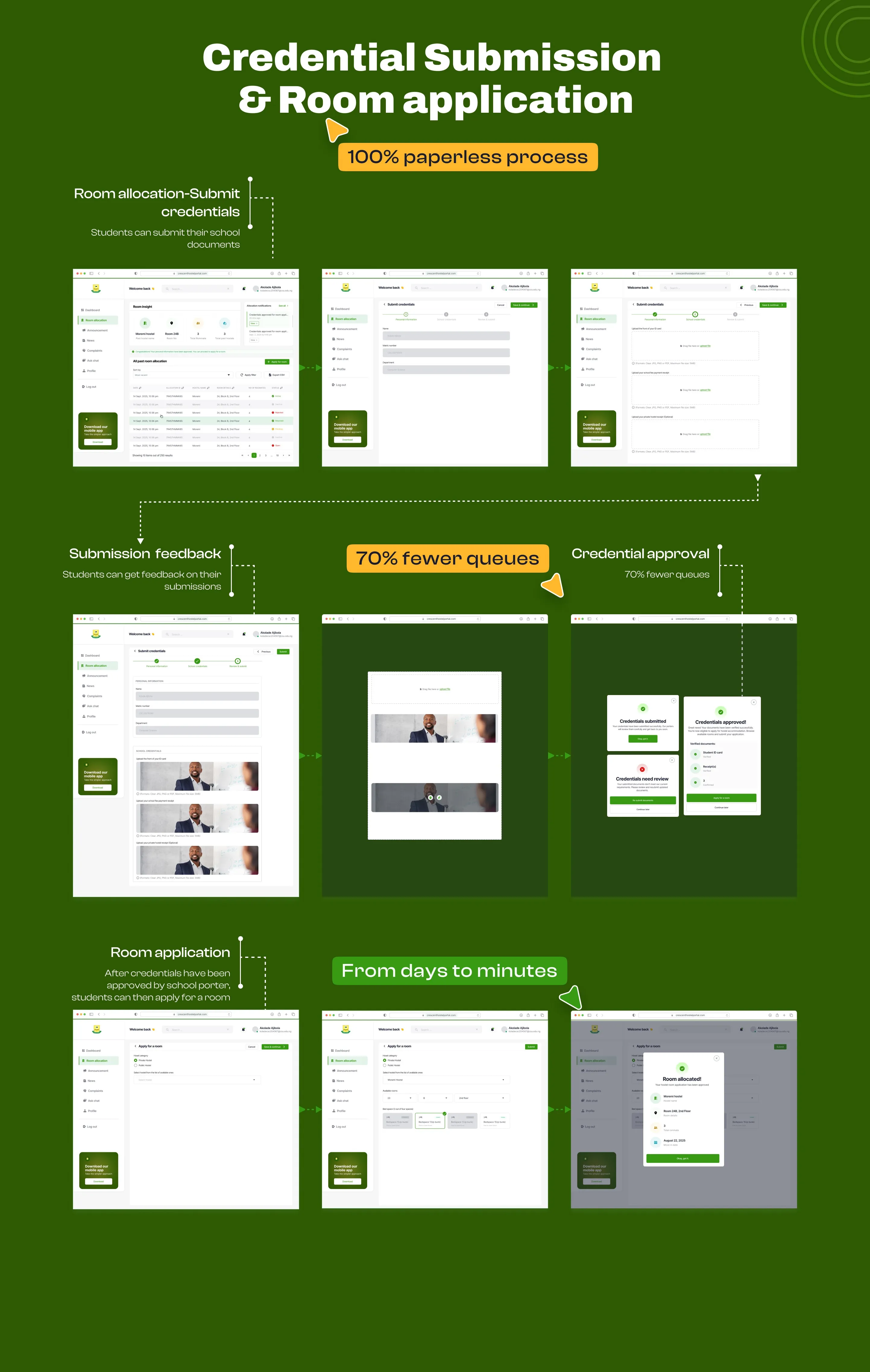
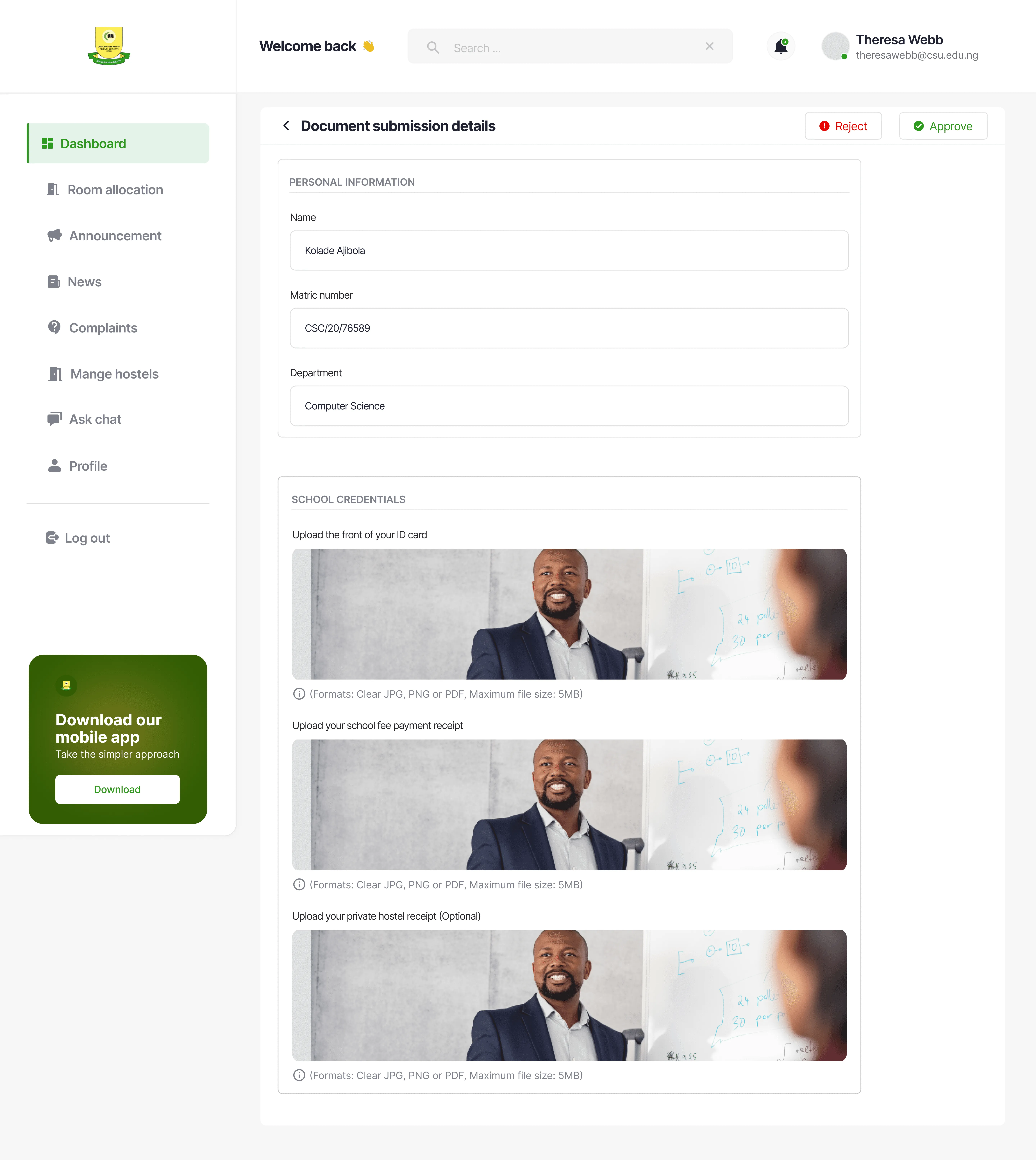
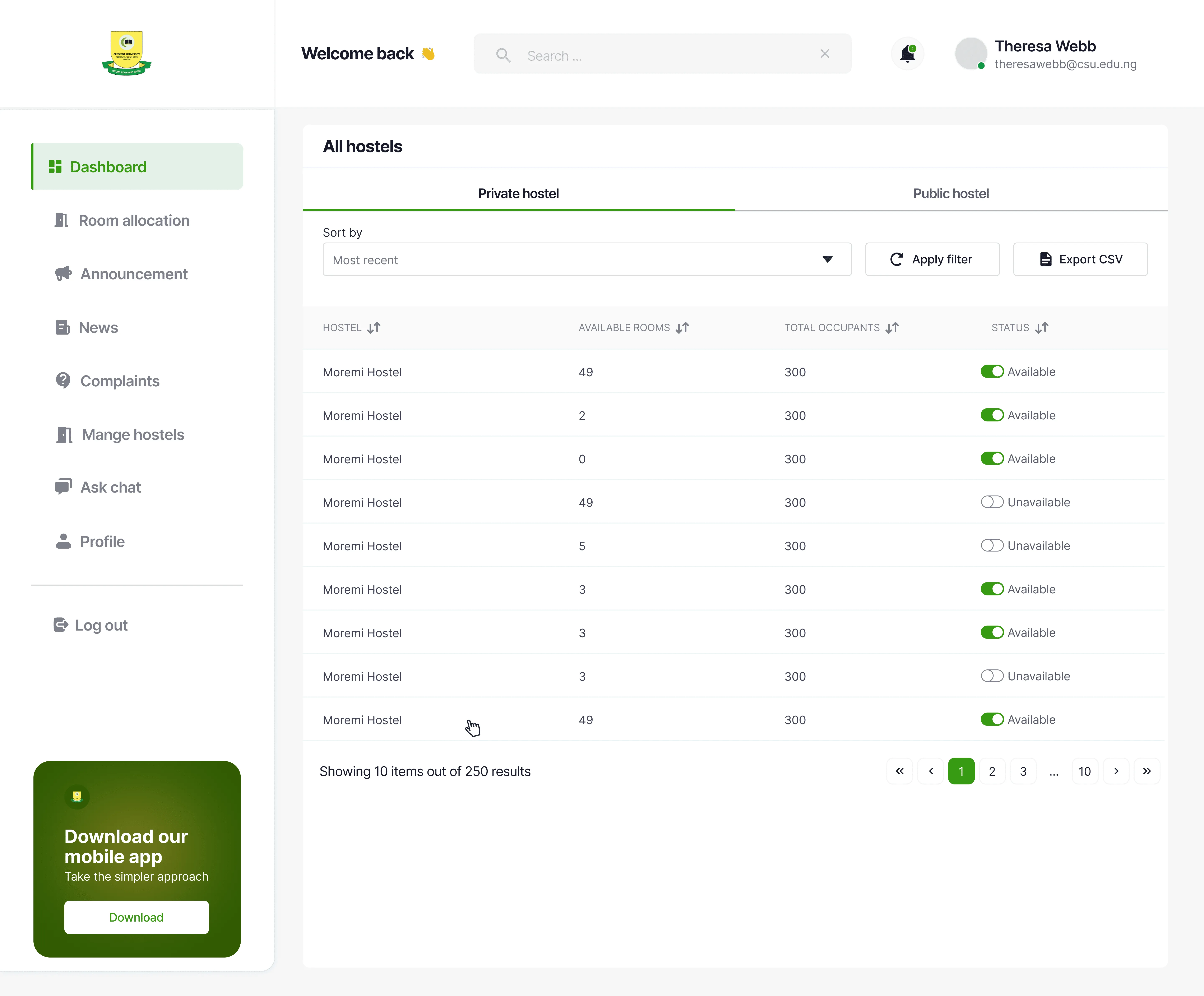
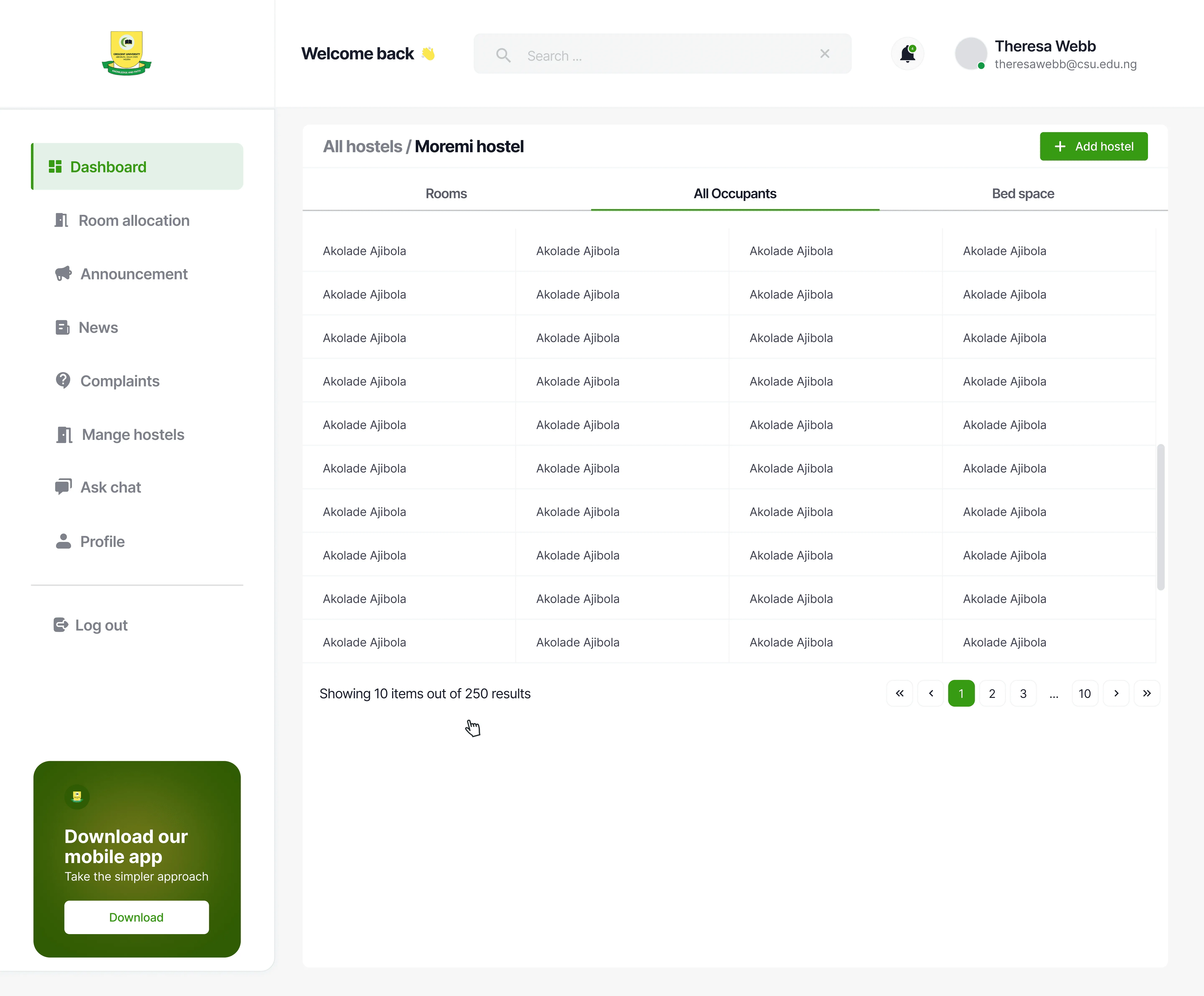
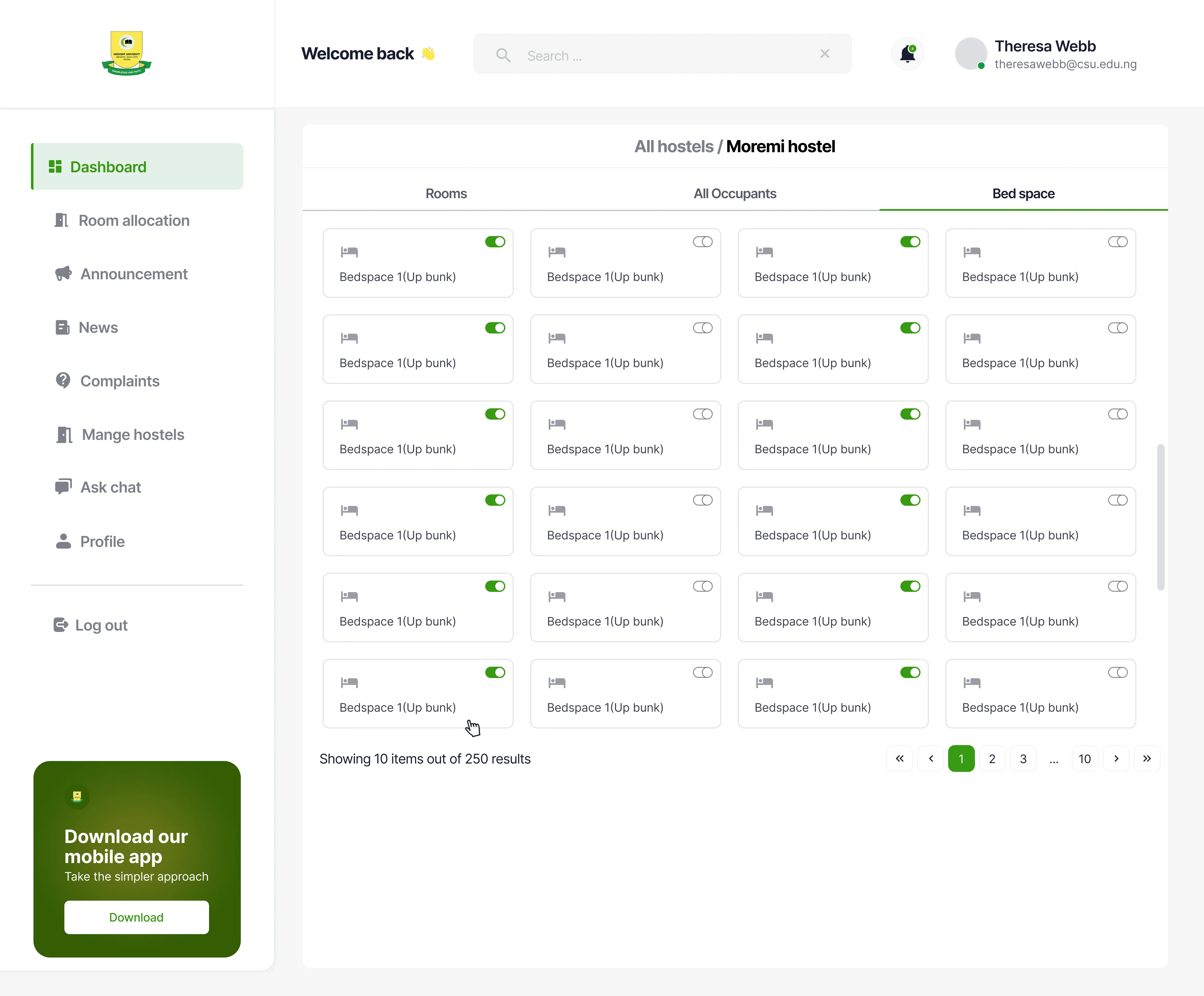
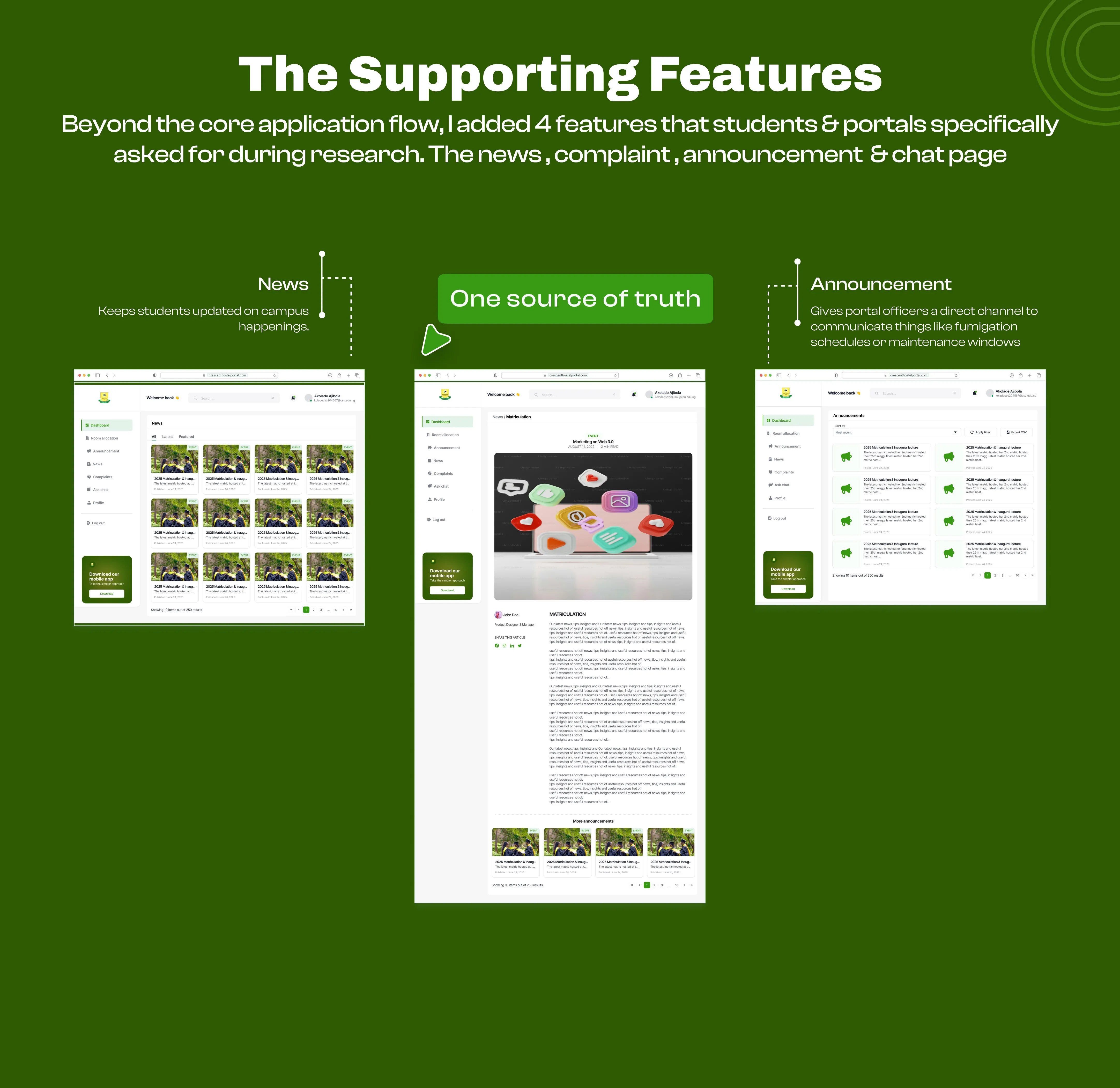
Four features born from user requests: Campus news and announcements so students stay informed. Ask Chat for quick answers without hunting down emails. And a Complaints page that tracks issues to resolution—not into a void.
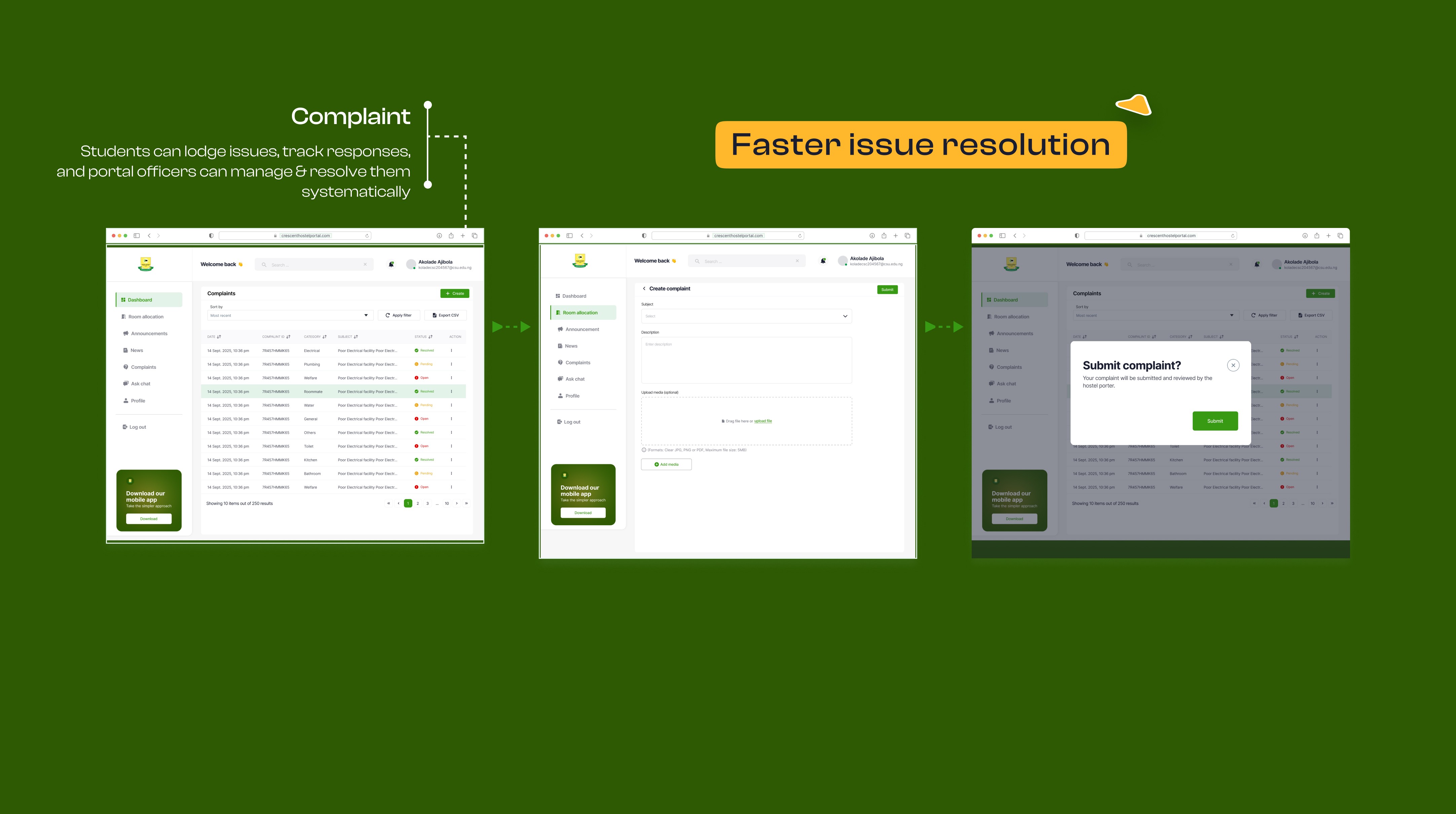
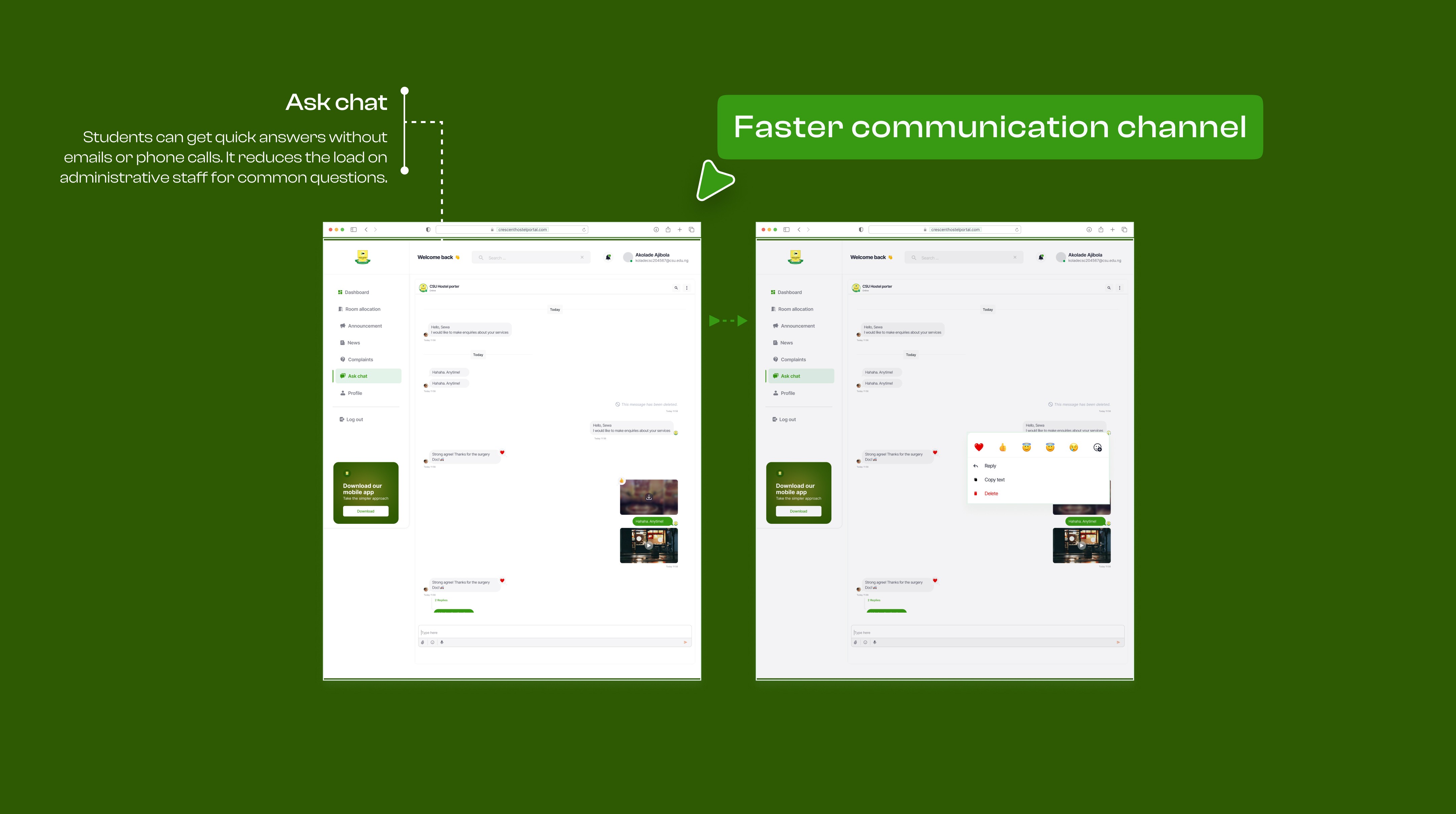
Based on 2,000 applications per session:
↪ Faster processing → weeks becomes 3 days
↪ Less verification time → Officers reclaim hours per week
↪ Fewer office visits → Students save hours each
↪ Zero double-bookings → Down frommutiple bookings per session
↪ Hours saved per cycle → Just from conflict resolution
The result: Officers focus on work that matters. Students get answers instantly. Lost documents become impossible.
While it's too early to have concrete metrics, success will be measured through:
Customer feedback
Customer feedback mentioning faster & easier application
Fewer office visits Less Stress
Reduced stress from Portals and students
Increased engagement
increased engagement with the system during resumption
Qualitative feedback
Qualitative feedback from users expressing appreciation
Mobile-first from day one: Most students browse on phones. The web version works, but it's not optimal. I should've started there.
AI document verification: Auto-verify against the university payment database, flag only exceptions for human review. Would cut processing time even further.
Smarter chatbot: Upgrade from rule-based to AI-powered, trained on actual student questions to reduce support load even more.